Unlock a world of possibilities! Login now and discover the exclusive benefits awaiting you.
- Qlik Community
- :
- All Forums
- :
- QlikView App Dev
- :
- count created and closed dates within actual month
- Subscribe to RSS Feed
- Mark Topic as New
- Mark Topic as Read
- Float this Topic for Current User
- Bookmark
- Subscribe
- Mute
- Printer Friendly Page
- Mark as New
- Bookmark
- Subscribe
- Mute
- Subscribe to RSS Feed
- Permalink
- Report Inappropriate Content
count created and closed dates within actual month
Hi everyone!
I have a data like table below (DD/MM/YYYY)
| Open Date | Close Date |
|---|---|
| 01/09/2018 | 02/10/2018 |
| 20/09/2018 | 10/10/2018 |
| 25/09/2018 | 27/09/2018 |
| 03/10/2018 | 15/10/2018 |
| 17/10/2018 |
I had this output in Excel using COUNTIFS whether checking if was open in that month and closed in another. Output is like this:
| Month | New | Closed | Accumulated |
|---|---|---|---|
| September,2018 | 3 | 1 | 2 |
| October,2018 | 2 | 3 | 0 |
| Pending | 1 |
Pending is count of blanks close date cells
Additionally, I also was tracking how many cases were accumulated between months, my equation was: Acummulated+New-Closed.
For each month as example:
February = 1+2-3 = 0
January = 0+3-1 = 2
Notice, that I used pending cases to generate accumulated of actual month.
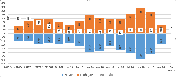
My point is, how can I create a graph like this using Qlik?
(please, ignore quarters, I just need month)
Orange: Closed
Blue: New
White points: Accumulated
I make work for open cases, but when I tried to count the closed cases it returns the same value of open cases.
I'm attaching all files that I'm using.
I would appreciate if someone can help me.
Regards!