Unlock a world of possibilities! Login now and discover the exclusive benefits awaiting you.
- Qlik Community
- :
- All Forums
- :
- QlikView App Dev
- :
- cumulative figures on chart not as expected
- Subscribe to RSS Feed
- Mark Topic as New
- Mark Topic as Read
- Float this Topic for Current User
- Bookmark
- Subscribe
- Mute
- Printer Friendly Page
- Mark as New
- Bookmark
- Subscribe
- Mute
- Subscribe to RSS Feed
- Permalink
- Report Inappropriate Content
cumulative figures on chart not as expected
HI
I'm trying to produce a line graph to display a year on year trend for the cumulative sales
the data comes in looking like the attached excel file 'imported data'
the members are summed by month and I can produce a quantity of members by month/ year
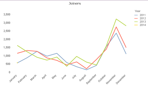
If the chart is a straight / pivot table I can also produce the cumulative totals
using
rangesum(Above(Column(1),0,RowNo()))
or similar
however when i then try and look at it in chart form even though im using the same template as the graph above it cumulates all the years on top of one another. I can seperate the year out by selecting the years from a list box but ideally being able to see them all together would be more beneficial.
Is there a simple way of doing this.
Sorry but cant send actual data or script , hopefully the description above is adequete
- Tags:
- new_to_qlikview
Accepted Solutions
- Mark as New
- Bookmark
- Subscribe
- Mute
- Subscribe to RSS Feed
- Permalink
- Report Inappropriate Content
Try setting the accumulation option for your expression, --sum(Members)?--, to Full Accumulation.
talk is cheap, supply exceeds demand
- Mark as New
- Bookmark
- Subscribe
- Mute
- Subscribe to RSS Feed
- Permalink
- Report Inappropriate Content
Hi Lee
Not sure to understand what you want but if the goal is to show a graph like above (year and month dimensions) with cumulated values it exists a property where you just check "cumulate" in expression tab
best regards
Chris
- Mark as New
- Bookmark
- Subscribe
- Mute
- Subscribe to RSS Feed
- Permalink
- Report Inappropriate Content
Try setting the accumulation option for your expression, --sum(Members)?--, to Full Accumulation.
talk is cheap, supply exceeds demand
- Mark as New
- Bookmark
- Subscribe
- Mute
- Subscribe to RSS Feed
- Permalink
- Report Inappropriate Content
slaps head  , oh of course.. many thanks