Unlock a world of possibilities! Login now and discover the exclusive benefits awaiting you.
- Qlik Community
- :
- All Forums
- :
- QlikView App Dev
- :
- Re: draw a correlation graph
- Subscribe to RSS Feed
- Mark Topic as New
- Mark Topic as Read
- Float this Topic for Current User
- Bookmark
- Subscribe
- Mute
- Printer Friendly Page
- Mark as New
- Bookmark
- Subscribe
- Mute
- Subscribe to RSS Feed
- Permalink
- Report Inappropriate Content
draw a correlation graph
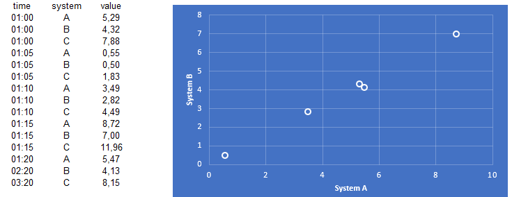
I'm trying to create a correlation graph as in the following example. Values plotted are from diferent systems at a single time. Any suggestions?
- Tags:
- qlikview_scripting
Accepted Solutions
- Mark as New
- Bookmark
- Subscribe
- Mute
- Subscribe to RSS Feed
- Permalink
- Report Inappropriate Content
Here is how I would replicate your chart.
Create a scatter chart.
Dimensions: time
Expressions: Sum({<system={A}>}value), Sum({<system={B}>}value)
- Mark as New
- Bookmark
- Subscribe
- Mute
- Subscribe to RSS Feed
- Permalink
- Report Inappropriate Content
Here is how I would replicate your chart.
Create a scatter chart.
Dimensions: time
Expressions: Sum({<system={A}>}value), Sum({<system={B}>}value)
- Mark as New
- Bookmark
- Subscribe
- Mute
- Subscribe to RSS Feed
- Permalink
- Report Inappropriate Content
Perry, did Lisa's suggestion/example help you get what you needed? If so, do not forget to return to the thread and use the Accept as Solution button on her post to give her credit and let others know that worked. The only additional thing I can offer is a Design Blog post related to the Scatter Chart Lisa mentioned in case you may be having issues with that:
https://community.qlik.com/t5/Qlik-Design-Blog/Recipe-for-a-Scatter-Chart/ba-p/1468860
If you are still working on things, leave an update, and we can see if we can come up with anything else.
Regards,
Brett
I now work a compressed schedule, Tuesday, Wednesday and Thursday, so those will be the days I will reply to any follow-up posts.
- Mark as New
- Bookmark
- Subscribe
- Mute
- Subscribe to RSS Feed
- Permalink
- Report Inappropriate Content
Hi Brett,
Enthousiastic about the solution, I forgot to post this at the forum. Solution of Lisa worked perfectly!. Thanks Lisa

