Unlock a world of possibilities! Login now and discover the exclusive benefits awaiting you.
- Qlik Community
- :
- All Forums
- :
- QlikView App Dev
- :
- how to change axis values in stacked bar chart?
- Subscribe to RSS Feed
- Mark Topic as New
- Mark Topic as Read
- Float this Topic for Current User
- Bookmark
- Subscribe
- Mute
- Printer Friendly Page
- Mark as New
- Bookmark
- Subscribe
- Mute
- Subscribe to RSS Feed
- Permalink
- Report Inappropriate Content
how to change axis values in stacked bar chart?
Hi all,
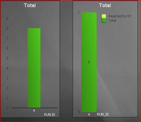
I have this 2 charts.
The left one is a regular bar chart with 1 expression.
the right one is a stacked bar chart with 2 expression that should appear on 1 bar.
the 2 Totals should have the same value (8), with stacked one divided (example (6,2), (8,0) etc.)
I want to arrange them graphically and make them similar for comparison:
1) how do I center the right graph?
2) how do I make the Y axis on the right one to be the same as the left one?
I thought about doing it all in one graph but as far as I know you can't put normal bar with stacked ones in one graph.
would appreciate ant help!
Thanks!
- Mark as New
- Bookmark
- Subscribe
- Mute
- Subscribe to RSS Feed
- Permalink
- Report Inappropriate Content
You can try to keep the two in the same bar chart if you experiment with Synthetic Dimensions (function ValueList) and try to condition the second dimension on the value of the first. I've never done it, but I have a feeling that it can be done.
As far as keeping two separate charts aligned, it's quite tricky. You can get close but you'd never get the two perfectly identical.
To keep the same Axis scale, replace automatic scale with the manual scale and calculate the value in the same variable that you can use in both charts as the maximum. Then, try to make the two charts as close as possible in terms of their attributes - for example, add a dummy dimension to the first chat, to force a Legend. The closer you can keep the attributes of the two charts, the more similar they would look like.
- Mark as New
- Bookmark
- Subscribe
- Mute
- Subscribe to RSS Feed
- Permalink
- Report Inappropriate Content
Didn't understand how ValueList can help me through the description in QV.
I need the right bar to be stacked, and the two bars in general are calculated on entirely different dimensions.
the second proposition is not working as the Max value of the axis doesn't get the max value that I put there.
- Mark as New
- Bookmark
- Subscribe
- Mute
- Subscribe to RSS Feed
- Permalink
- Report Inappropriate Content
I think it is not possible to do this. However you could always add a "phony" dimension to the first chart, making the diagram the same - and hence make them easier to look the same. See attached.
Johan
- Mark as New
- Bookmark
- Subscribe
- Mute
- Subscribe to RSS Feed
- Permalink
- Report Inappropriate Content
didn't get the attachment
- Mark as New
- Bookmark
- Subscribe
- Mute
- Subscribe to RSS Feed
- Permalink
- Report Inappropriate Content
I can see it. Attaching again.