Unlock a world of possibilities! Login now and discover the exclusive benefits awaiting you.
Announcements
Save $650 on Qlik Connect, Dec 1 - 7, our lowest price of the year. Register with code CYBERWEEK: Register
- Qlik Community
- :
- All Forums
- :
- QlikView App Dev
- :
- Re: how to customize blocks in Mekko Chart
Options
- Subscribe to RSS Feed
- Mark Topic as New
- Mark Topic as Read
- Float this Topic for Current User
- Bookmark
- Subscribe
- Mute
- Printer Friendly Page
Turn on suggestions
Auto-suggest helps you quickly narrow down your search results by suggesting possible matches as you type.
Showing results for
Anonymous
Not applicable
2014-12-23
02:58 PM
- Mark as New
- Bookmark
- Subscribe
- Mute
- Subscribe to RSS Feed
- Permalink
- Report Inappropriate Content
how to customize blocks in Mekko Chart
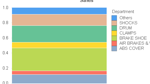
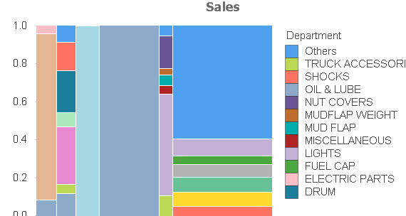
I am doing a set analysis for a certain vendor out of 90 of them. I dont like the current image, its too plain( the 1st image). how do I change the chart into something more like mekko chart, the 2nd image below:-
525 Views
1 Reply
Partner - Champion III
2014-12-23
03:15 PM
- Mark as New
- Bookmark
- Subscribe
- Mute
- Subscribe to RSS Feed
- Permalink
- Report Inappropriate Content
You'll have to add a second dimension for that. If you don't have a second dimension you need to create it in some way in the script by dividing the departments into groups.
talk is cheap, supply exceeds demand
434 Views