Unlock a world of possibilities! Login now and discover the exclusive benefits awaiting you.
- Qlik Community
- :
- All Forums
- :
- QlikView App Dev
- :
- if else.. issue
- Subscribe to RSS Feed
- Mark Topic as New
- Mark Topic as Read
- Float this Topic for Current User
- Bookmark
- Subscribe
- Mute
- Printer Friendly Page
- Mark as New
- Bookmark
- Subscribe
- Mute
- Subscribe to RSS Feed
- Permalink
- Report Inappropriate Content
if else.. issue
Hi,
I have a requirement as briefed below,
Please refer the table below,
account id, description, amount
1, Salary, 100
2, Bonus, 20
from above table I need to build a chart to show the salary & Salary + Bonus trendline. If condition doesn't helps..
Salary = 100
Salary+Bonus = 100 + 20 = 120
Could anyone please help me on this?
Thanks & Regards,
Karthikeyan.
- « Previous Replies
-
- 1
- 2
- Next Replies »
Accepted Solutions
- Mark as New
- Bookmark
- Subscribe
- Mute
- Subscribe to RSS Feed
- Permalink
- Report Inappropriate Content
Hi,
You can have Year as dimension.
1st Expression will be Sum(Salary)
2nd Will be Sum(Salary) + Sum(Bonus) Give label as Salary + Bonus
Show them as Line chart and you are done.
Regards,
Kaushik Solanki
- Mark as New
- Bookmark
- Subscribe
- Mute
- Subscribe to RSS Feed
- Permalink
- Report Inappropriate Content
Hi,
You can create an intermediate table like shown below.
account id, description, amount
1, Salary, 100
2, Bonus, 20
description,Display
Salary,Salary+Bonus
Bonus,Salary+Bonus
Link this table in your data model and then use the Display field in dimension to get required output.
Regards,
Kaushik Solanki
- Mark as New
- Bookmark
- Subscribe
- Mute
- Subscribe to RSS Feed
- Permalink
- Report Inappropriate Content
Usually, a trendline is time-based. Do you have historical information on Salaries and Bonuses?
Peter
- Mark as New
- Bookmark
- Subscribe
- Mute
- Subscribe to RSS Feed
- Permalink
- Report Inappropriate Content
Yes I do have...
Let me rephrase the table,
Year, account id, description, amount
2009,1, Salary, 100
2010,2, Bonus, 20
2010,1, Salary, 150
2011,2, Bonus, 20
2012,1, Salary, 200
2013,2, Bonus, 20
2014,1, Salary, 250
2015,2, Bonus, 20
- Mark as New
- Bookmark
- Subscribe
- Mute
- Subscribe to RSS Feed
- Permalink
- Report Inappropriate Content
Hi Kaushik,
Thanks for your reply.
In your case it will be as two measures. but i want them into dimensions.
Warm Regards,
Karthikeyan.
- Mark as New
- Bookmark
- Subscribe
- Mute
- Subscribe to RSS Feed
- Permalink
- Report Inappropriate Content
Hi,
Could you tell me what output is expected from the table which you have shown.
Regards,
Kaushik Solanki
- Mark as New
- Bookmark
- Subscribe
- Mute
- Subscribe to RSS Feed
- Permalink
- Report Inappropriate Content
- Mark as New
- Bookmark
- Subscribe
- Mute
- Subscribe to RSS Feed
- Permalink
- Report Inappropriate Content
Hi,
I guess what you have done is right.
You will need two expression one for sales and other for Sales + Bonus.
If not then please help us to understand with example and sample data.
Regards,
Kaushik Solanki
- Mark as New
- Bookmark
- Subscribe
- Mute
- Subscribe to RSS Feed
- Permalink
- Report Inappropriate Content
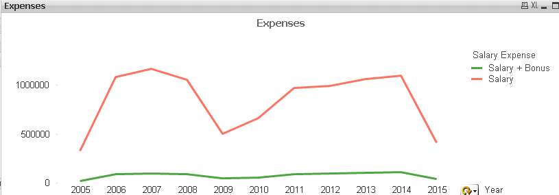
Year & Salary Expense is the dimensions
Amount is the measure
- Mark as New
- Bookmark
- Subscribe
- Mute
- Subscribe to RSS Feed
- Permalink
- Report Inappropriate Content
Hi,
You can have Year as dimension.
1st Expression will be Sum(Salary)
2nd Will be Sum(Salary) + Sum(Bonus) Give label as Salary + Bonus
Show them as Line chart and you are done.
Regards,
Kaushik Solanki
- « Previous Replies
-
- 1
- 2
- Next Replies »