Unlock a world of possibilities! Login now and discover the exclusive benefits awaiting you.
Announcements
Qlik Open Lakehouse is Now Generally Available! Discover the key highlights and partner resources here.
- Qlik Community
- :
- All Forums
- :
- QlikView App Dev
- :
- Re: make a chart like this
Options
- Subscribe to RSS Feed
- Mark Topic as New
- Mark Topic as Read
- Float this Topic for Current User
- Bookmark
- Subscribe
- Mute
- Printer Friendly Page
Turn on suggestions
Auto-suggest helps you quickly narrow down your search results by suggesting possible matches as you type.
Showing results for
Not applicable
2016-09-06
02:26 AM
- Mark as New
- Bookmark
- Subscribe
- Mute
- Subscribe to RSS Feed
- Permalink
- Report Inappropriate Content
make a chart like this
Hi,
everyone, how could i make a chart like that below in qlikview?
the attchment is the example data, so if I need to know counts of "ID" in per "city" and per "age" by "sex", how to?

4 Replies
Partner - Specialist
2016-09-06
02:56 AM
- Mark as New
- Bookmark
- Subscribe
- Mute
- Subscribe to RSS Feed
- Permalink
- Report Inappropriate Content
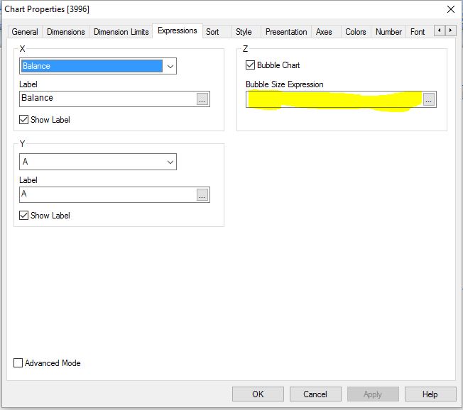
Write down your expression in the indicated place.
after that bubble size will be adjusted according to this same expression.
please find the attachment for the ready reference
Warm Regards,
Susovan
Susovan
440 Views
Not applicable
2016-09-06
03:09 AM
Author
- Mark as New
- Bookmark
- Subscribe
- Mute
- Subscribe to RSS Feed
- Permalink
- Report Inappropriate Content
so, could you make it out? though I donot think you have solved it.
440 Views
Master II
2016-09-06
03:18 AM
- Mark as New
- Bookmark
- Subscribe
- Mute
- Subscribe to RSS Feed
- Permalink
- Report Inappropriate Content
Hi X,
Can you share a sample data. Then it will be easy to create a chart.
Regards
KC
Best Regards,
KC
KC
440 Views
Not applicable
2016-09-06
04:43 AM
Author
- Mark as New
- Bookmark
- Subscribe
- Mute
- Subscribe to RSS Feed
- Permalink
- Report Inappropriate Content
440 Views