Unlock a world of possibilities! Login now and discover the exclusive benefits awaiting you.
- Qlik Community
- :
- All Forums
- :
- QlikView App Dev
- :
- Re: qlikview-barchart
- Subscribe to RSS Feed
- Mark Topic as New
- Mark Topic as Read
- Float this Topic for Current User
- Bookmark
- Subscribe
- Mute
- Printer Friendly Page
- Mark as New
- Bookmark
- Subscribe
- Mute
- Subscribe to RSS Feed
- Permalink
- Report Inappropriate Content
qlikview-barchart
Hello,guys:
I wanna do this kind of bar chart with qlikview, maybe i have to do two bar charts, but how can i finish the left one,the axes is on the right,so do you guys have any ideas?
BTY, there are two KPIs and a dimension.
Thanks
- « Previous Replies
-
- 1
- 2
- Next Replies »
- Mark as New
- Bookmark
- Subscribe
- Mute
- Subscribe to RSS Feed
- Permalink
- Report Inappropriate Content
Add Minus to both the expressions in the expression tab like
- Count(colName)
Then uncheck show legend in the dimensions tab for the dimension used.
Thanks,
V.
- Mark as New
- Bookmark
- Subscribe
- Mute
- Subscribe to RSS Feed
- Permalink
- Report Inappropriate Content
Continuation should be. As i understand, User want to see the values in +Ve values
1) so you need to arrange the format from Number tab of each expression is Integer ---> #,##0; #,##0
2) Same as Sales Person
3) Sort Tab -- Y-Value --> Ascending
4) From Axis Tab - Each expression width should be o Pixel
Good Luck 
- Mark as New
- Bookmark
- Subscribe
- Mute
- Subscribe to RSS Feed
- Permalink
- Report Inappropriate Content
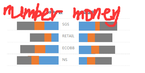
Not sure if you are looking this way of display of charts. Please let me know if that helps
- Mark as New
- Bookmark
- Subscribe
- Mute
- Subscribe to RSS Feed
- Permalink
- Report Inappropriate Content
thanks,that's a good idea
- Mark as New
- Bookmark
- Subscribe
- Mute
- Subscribe to RSS Feed
- Permalink
- Report Inappropriate Content
Thanks very much.I have finished by your method
- Mark as New
- Bookmark
- Subscribe
- Mute
- Subscribe to RSS Feed
- Permalink
- Report Inappropriate Content
Thanks Anil for that. Yes, just change these things accordingly.
The Number format doesn't change until explicitly changed. But good to cross check the tabs.
Ryan, please let us know if this suffice your requirement.
Thanks,
V.
- Mark as New
- Bookmark
- Subscribe
- Mute
- Subscribe to RSS Feed
- Permalink
- Report Inappropriate Content
Yes,Anil and Vishsaggi are correct
- Mark as New
- Bookmark
- Subscribe
- Mute
- Subscribe to RSS Feed
- Permalink
- Report Inappropriate Content
One more thing Ryan, once you have this chart, when you hover over the bar chart on left, the pop up shows as -ve value. So to overwrite this follow below tips:
On the left hand chart,
1. Presentation Tab: uncheck pop up labels.
2. Expression Tab : Expr1: Add = 'Sales Person =' & COUNT ([Trade Revenue]) -> Uncheck Bar -> And check Text as popup
Expr2: Add = 'Amount = ' & Sum (IF([Commission %]=0,[Trade Amount]))/100000 -> Uncheck Bar
-> And check text as popup
Let me know if this helps. It might need little tweak around though.
Let us know how it goes.
Thanks,
V.
- Mark as New
- Bookmark
- Subscribe
- Mute
- Subscribe to RSS Feed
- Permalink
- Report Inappropriate Content
I have finished this chart.Just like you guys said.Thanks so much.
- « Previous Replies
-
- 1
- 2
- Next Replies »