Unlock a world of possibilities! Login now and discover the exclusive benefits awaiting you.
- Qlik Community
- :
- All Forums
- :
- QlikView App Dev
- :
- Re: Combo Chart Empty Values
- Subscribe to RSS Feed
- Mark Topic as New
- Mark Topic as Read
- Float this Topic for Current User
- Bookmark
- Subscribe
- Mute
- Printer Friendly Page
- Mark as New
- Bookmark
- Subscribe
- Mute
- Subscribe to RSS Feed
- Permalink
- Report Inappropriate Content
Combo Chart Empty Values
I am playing around in Qlik Sense and am fairly new. I am pretty decent with Qlikview, but there are of course subtle differences.
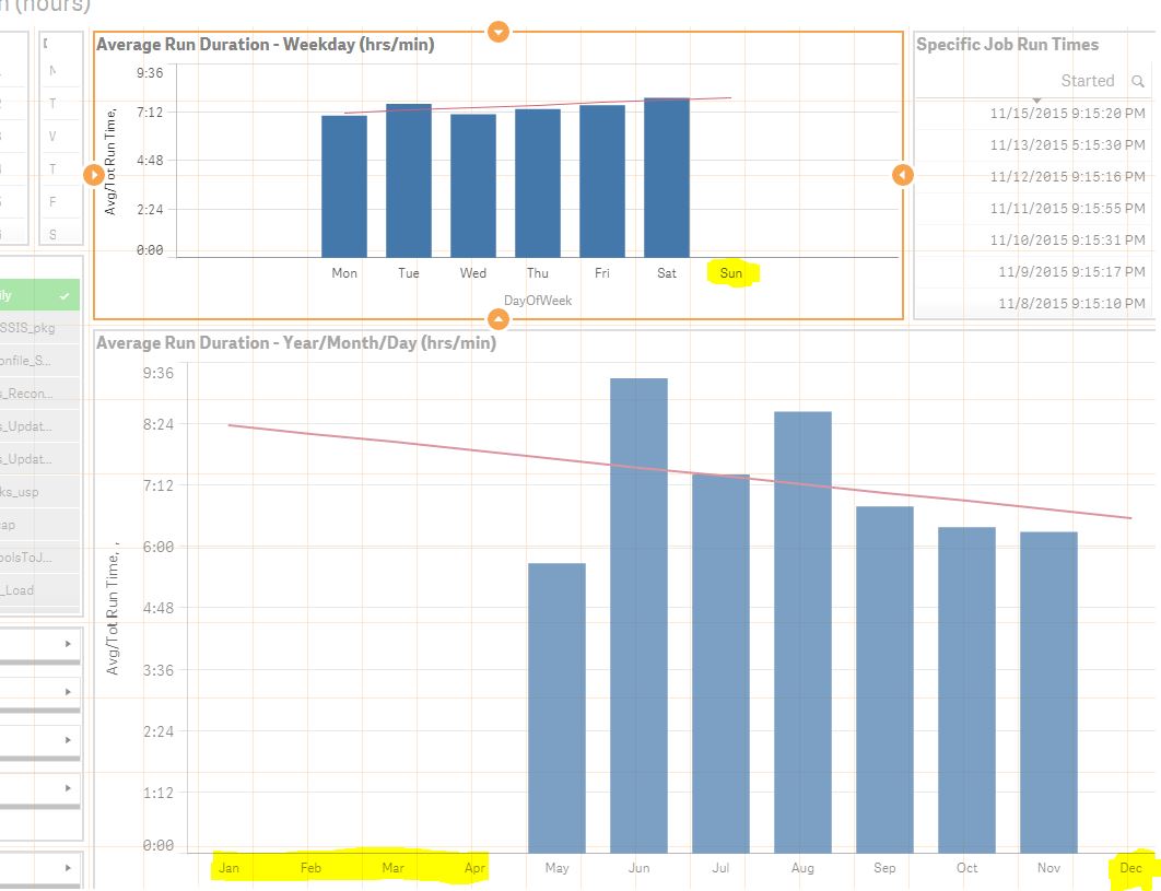
I created a Combo Chart with the sum and average of job run times by year, month, and day. They don't have a way to easily add trend lines in Qliksense that I have seen, so I added a formula that others had been sharing that created one, but this adds in all values without data to the chart as you can see below.
-Anyone find a good way to remove the extra months/values that are added? I've tried to tinker with all of the settings and options.
-Also, anyone find a way to choose the display of the Y-Axis? the way it splits the hours is very odd... why not just 1:00, 2:00, 3:00, ect?
Here is the trend line formula that also adds the extra zero'ed values:
linest_m(total aggr(if(avg(Run_Time),avg(Run_Time)),DayOfWeek),DayOfWeek)* only({1}DayOfWeek)+linest_b(total aggr(if(avg(Run_Time),avg(Run_Time)),DayOfWeek),DayOfWeek)
Accepted Solutions
- Mark as New
- Bookmark
- Subscribe
- Mute
- Subscribe to RSS Feed
- Permalink
- Report Inappropriate Content
Have you tried something like this:
IF (calculation1 > 0, calculation2)
- condition your trend line calculation on the fact that the "regular" calculation is non-zero?
cheers,
Oleg Troyansky