Unlock a world of possibilities! Login now and discover the exclusive benefits awaiting you.
- Qlik Community
- :
- All Forums
- :
- QlikView App Dev
- :
- Complex Chart Help
- Subscribe to RSS Feed
- Mark Topic as New
- Mark Topic as Read
- Float this Topic for Current User
- Bookmark
- Subscribe
- Mute
- Printer Friendly Page
- Mark as New
- Bookmark
- Subscribe
- Mute
- Subscribe to RSS Feed
- Permalink
- Report Inappropriate Content
Complex Chart Help
Hi,
I need to recreate an Excel chart within Qlikview. This is the excel chart 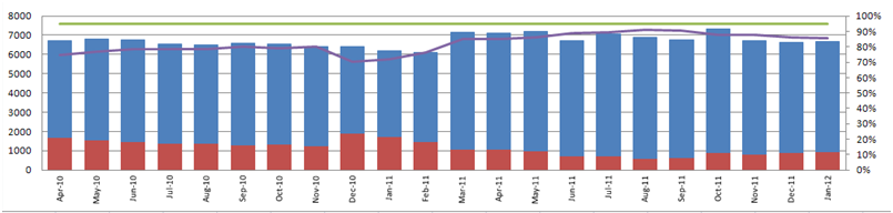
The above chart is showing :
- The sum of Total Finishers (blue stack)
- The sum of those that Did Not Finish (red stack)
- Target Rate (Green Line)
- Actual Did Not Finish Rate (Purple Line)
Also, can the Number Axes be shown on the right and the rate Axes be shown on the left.
Ive attached a sample attempt, but cant get the rate to show and target to show correctly (due to the size of the left axes).
Can anyone help?
Many Thanks,
Fiorano
Accepted Solutions
- Mark as New
- Bookmark
- Subscribe
- Mute
- Subscribe to RSS Feed
- Permalink
- Report Inappropriate Content
hi check the attach file
- Mark as New
- Bookmark
- Subscribe
- Mute
- Subscribe to RSS Feed
- Permalink
- Report Inappropriate Content
hi check the attach file
- Mark as New
- Bookmark
- Subscribe
- Mute
- Subscribe to RSS Feed
- Permalink
- Report Inappropriate Content
Check out the attachment
- Mark as New
- Bookmark
- Subscribe
- Mute
- Subscribe to RSS Feed
- Permalink
- Report Inappropriate Content
Perfect Thanks!!
- Mark as New
- Bookmark
- Subscribe
- Mute
- Subscribe to RSS Feed
- Permalink
- Report Inappropriate Content
I hope you dont mind my asking. I'm trying to set up a Gauge Chart using the same data by Year. Do you have any experience of these charts? I will need a Red, Amber, Green format to it. With Red being less than 90% of the Target field, Amber 90-99% of the target and green >99% of Target.
Really appreciate your help.
Fiorano
- Mark as New
- Bookmark
- Subscribe
- Mute
- Subscribe to RSS Feed
- Permalink
- Report Inappropriate Content
Hie see the doc have created the gauge chart for RATE.
- Mark as New
- Bookmark
- Subscribe
- Mute
- Subscribe to RSS Feed
- Permalink
- Report Inappropriate Content
Perfect Many thanks!
Fiorano