Unlock a world of possibilities! Login now and discover the exclusive benefits awaiting you.
- Qlik Community
- :
- All Forums
- :
- QlikView App Dev
- :
- How to add reference area in line chart?
- Subscribe to RSS Feed
- Mark Topic as New
- Mark Topic as Read
- Float this Topic for Current User
- Bookmark
- Subscribe
- Mute
- Printer Friendly Page
- Mark as New
- Bookmark
- Subscribe
- Mute
- Subscribe to RSS Feed
- Permalink
- Report Inappropriate Content
How to add reference area in line chart?
Hi folks,
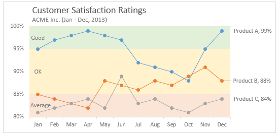
In the QlikView line chart, I could find the reference line, but how could I define the reference area? Sample one is attached. For example I want to set the range from 95% to 100% is in green, etc.
Accepted Solutions
- Mark as New
- Bookmark
- Subscribe
- Mute
- Subscribe to RSS Feed
- Permalink
- Report Inappropriate Content
I could imagine that it might be possible with two charts (one as the normal line-chart and the other as a line-chart with the fourth option in tab design) which are laying over eachother with the appropriate adjustments on the various layout-options - hiding title, border, axis and so on respectively setting them to transparent with argb(0,0,0,0).
To sychronize both chart-axis you need to define the scaling with expressions maybe with something like this:
ceil((max(Total YourExpression) - min(Total YourExpression)) / NumberOfIntervals, RoundingArea)
I think it will need some effort to build such a construct but you should get quite near to what you want.
- Marcus
- Mark as New
- Bookmark
- Subscribe
- Mute
- Subscribe to RSS Feed
- Permalink
- Report Inappropriate Content
If your y axis scale doesn't change, you could use an image in the chart background.
- Mark as New
- Bookmark
- Subscribe
- Mute
- Subscribe to RSS Feed
- Permalink
- Report Inappropriate Content
Hi man,
Thanks a lot for your reply. Unfortunately, the y axis scale will be dynamic based on the metrics value.
- Mark as New
- Bookmark
- Subscribe
- Mute
- Subscribe to RSS Feed
- Permalink
- Report Inappropriate Content
I could imagine that it might be possible with two charts (one as the normal line-chart and the other as a line-chart with the fourth option in tab design) which are laying over eachother with the appropriate adjustments on the various layout-options - hiding title, border, axis and so on respectively setting them to transparent with argb(0,0,0,0).
To sychronize both chart-axis you need to define the scaling with expressions maybe with something like this:
ceil((max(Total YourExpression) - min(Total YourExpression)) / NumberOfIntervals, RoundingArea)
I think it will need some effort to build such a construct but you should get quite near to what you want.
- Marcus
- Mark as New
- Bookmark
- Subscribe
- Mute
- Subscribe to RSS Feed
- Permalink
- Report Inappropriate Content
Thanks a lot, man. I will try your solution.