Unlock a world of possibilities! Login now and discover the exclusive benefits awaiting you.
- Qlik Community
- :
- All Forums
- :
- QlikView App Dev
- :
- How to make this chart in Qlikview?
- Subscribe to RSS Feed
- Mark Topic as New
- Mark Topic as Read
- Float this Topic for Current User
- Bookmark
- Subscribe
- Mute
- Printer Friendly Page
- Mark as New
- Bookmark
- Subscribe
- Mute
- Subscribe to RSS Feed
- Permalink
- Report Inappropriate Content
How to make this chart in Qlikview?
Hi guys, I have to make a bar chart based on an excel analysis.
The chart has to look like this :
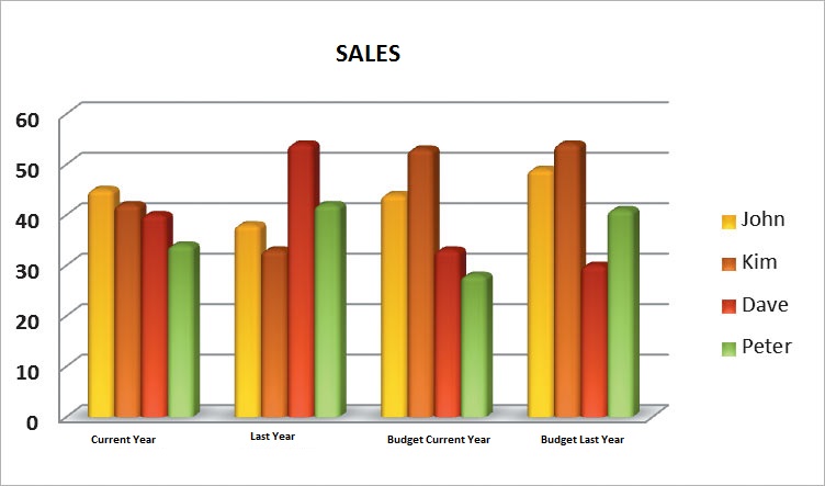
And I'm trying to figure it out how to do it in Qlikview. I'm trying to add new "fake" dimension in order to get a field called "pivotdimension" with values : CY, LY, Budget,... but I can't get the same result.
Any ideas?
Regards, Marcel.
- Mark as New
- Bookmark
- Subscribe
- Mute
- Subscribe to RSS Feed
- Permalink
- Report Inappropriate Content
Hi!

Sales:
Load * Inline [
SalesPer, Time, Sales
John, CY, 10
Kim, LY, 10
Dave, BCY, 10
Peter, BLY, 10
John, BLY, 10
Kim, CY, 10
Dave, LY, 10
Peter, BCY, 10
John, BCY, 4
Kim, BLY, 3
Dave, CY, 12
Peter, LY, 1
John, BLY, 9
Kim, BCY, 8
Dave, CY, 8
Peter, LY, 6
John, LY, 6
Kim, BCY, 5
Dave, BLY, 4
Peter, CY, 2
];
you don't need extra dimensions.


Br,
Miikka