Unlock a world of possibilities! Login now and discover the exclusive benefits awaiting you.
- Qlik Community
- :
- All Forums
- :
- QlikView App Dev
- :
- Label Dimension
- Subscribe to RSS Feed
- Mark Topic as New
- Mark Topic as Read
- Float this Topic for Current User
- Bookmark
- Subscribe
- Mute
- Printer Friendly Page
- Mark as New
- Bookmark
- Subscribe
- Mute
- Subscribe to RSS Feed
- Permalink
- Report Inappropriate Content
Label Dimension
Hi there,
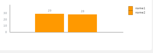
I'm facing a problem building a bar chart.
I have two expressions (1 and 2). For each of them I would like to have a label on the horizontal axis, instead of a legend on the right (as displayed in the picture) but I can't get it to work.
Does anyone have a clue on how to do it?
Thanks in advance.
Cheers,
Inês
- Tags:
- bar chart
Accepted Solutions
- Mark as New
- Bookmark
- Subscribe
- Mute
- Subscribe to RSS Feed
- Permalink
- Report Inappropriate Content
- Mark as New
- Bookmark
- Subscribe
- Mute
- Subscribe to RSS Feed
- Permalink
- Report Inappropriate Content
Hi,
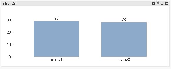
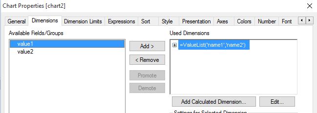
you could use the Valuelist function in a calculated dimension and contract your two expressions into one using Pick(Match(Valuelist, ... , ...), ... , ...)
hope this helps
regards
Marco
- Mark as New
- Bookmark
- Subscribe
- Mute
- Subscribe to RSS Feed
- Permalink
- Report Inappropriate Content
This is an easy one, go to the presentation tab in the object properties and un-tick the "Show Legend" option. This will give the result you need. Hope this works for you.
- Mark as New
- Bookmark
- Subscribe
- Mute
- Subscribe to RSS Feed
- Permalink
- Report Inappropriate Content
one example:
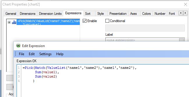
hope this helps
regards
Marco
- Mark as New
- Bookmark
- Subscribe
- Mute
- Subscribe to RSS Feed
- Permalink
- Report Inappropriate Content
Thank you! This is exactly what I was looking for.
It worked perfectly. I didn't know these functions, since I'm still quite new to QV.
Cheers,
Inês
- Mark as New
- Bookmark
- Subscribe
- Mute
- Subscribe to RSS Feed
- Permalink
- Report Inappropriate Content
Thanks for your answer  However, this would just disable the legend. What I wanted was to get the legend text but in the axis.
Cheers
- Mark as New
- Bookmark
- Subscribe
- Mute
- Subscribe to RSS Feed
- Permalink
- Report Inappropriate Content
Ok that is also no problem, just click on the object then hold down the Ctrl and Shift key at the same time. Red lines will appear around the elements in the chart. You can then make the bar chart bit a little smaller and wider and you can drag the legend box to thew bottom of the chart. If you make it wide you can then actually get the bits of the legend next to each other.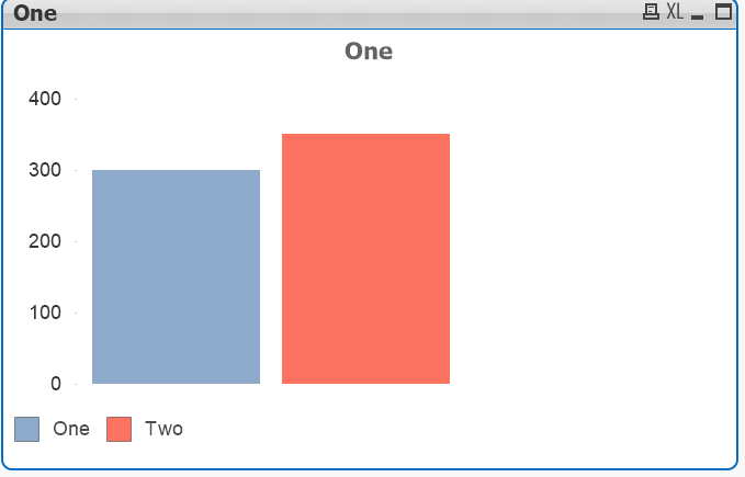
- Mark as New
- Bookmark
- Subscribe
- Mute
- Subscribe to RSS Feed
- Permalink
- Report Inappropriate Content
Oh yes and by disabling the legend the names of the expressions will appear under each bar without the need for complex expressions.
- Mark as New
- Bookmark
- Subscribe
- Mute
- Subscribe to RSS Feed
- Permalink
- Report Inappropriate Content
indeed, much simpler.
thank you
regards
Marco