Unlock a world of possibilities! Login now and discover the exclusive benefits awaiting you.
- Qlik Community
- :
- All Forums
- :
- QlikView App Dev
- :
- Re: Sales Launch Report - Possible in QV?
- Subscribe to RSS Feed
- Mark Topic as New
- Mark Topic as Read
- Float this Topic for Current User
- Bookmark
- Subscribe
- Mute
- Printer Friendly Page
- Mark as New
- Bookmark
- Subscribe
- Mute
- Subscribe to RSS Feed
- Permalink
- Report Inappropriate Content
Sales Launch Report - Possible in QV?
I'm trying to create a product launch report in QV that allows me to compare how fast sales performed by month by country.
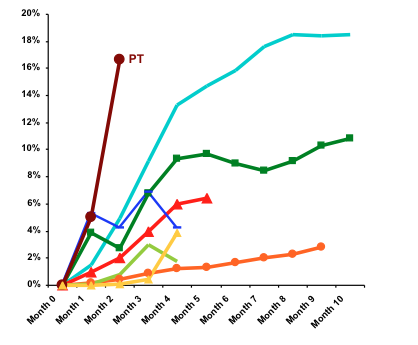
Its not a simple line chart, as a product is launched at different times (Jan for UK / Mar for Spain and maybe Apr for Italy). So want to align all the months to a single start point to see the sales velocity – see screen shot. You can see the x-axis is Month 0 / Month 1 / Month 2 etc
Is this possible in QV?
- Mark as New
- Bookmark
- Subscribe
- Mute
- Subscribe to RSS Feed
- Permalink
- Report Inappropriate Content
check above/below function
- Mark as New
- Bookmark
- Subscribe
- Mute
- Subscribe to RSS Feed
- Permalink
- Report Inappropriate Content
or post a sample file
- Mark as New
- Bookmark
- Subscribe
- Mute
- Subscribe to RSS Feed
- Permalink
- Report Inappropriate Content
You should in the load script create a calculated field like "number of days from launch". And then base your x-axis on that field.
Best Regards
Robert
- Mark as New
- Bookmark
- Subscribe
- Mute
- Subscribe to RSS Feed
- Permalink
- Report Inappropriate Content
I'd like to create an expression on a chart to produce the result - Since I have multiple product launches.
- Mark as New
- Bookmark
- Subscribe
- Mute
- Subscribe to RSS Feed
- Permalink
- Report Inappropriate Content
Thanks - I'll investigsate
- Mark as New
- Bookmark
- Subscribe
- Mute
- Subscribe to RSS Feed
- Permalink
- Report Inappropriate Content
Not 100% sure if this works for your data, but perhaps a solution with a calulated dimension (using the valueloop function) and then an expression which caluculates the date difference between launch date and transaction date and checks that number agains the valueloop dimension.
See attatched example of this kind of solution.
If it works, I'd still recomend to try to so a solution into the script if you have lots of data, because I think using dynamic dimensions and if expressions will be slow to work with for the end user if data is huge.
Regards,
Robert