Unlock a world of possibilities! Login now and discover the exclusive benefits awaiting you.
- Qlik Community
- :
- All Forums
- :
- QlikView App Dev
- :
- Re: plotting results of linest_m and linest_b - ne...
- Subscribe to RSS Feed
- Mark Topic as New
- Mark Topic as Read
- Float this Topic for Current User
- Bookmark
- Subscribe
- Mute
- Printer Friendly Page
- Mark as New
- Bookmark
- Subscribe
- Mute
- Subscribe to RSS Feed
- Permalink
- Report Inappropriate Content
plotting results of linest_m and linest_b - newbie
Hi,
For a set of values x, I am trying to show a line plot of y=mx+b, or as per expressions, y=linest_m(y,x)*x + linest_b(y,x). I want the line to change interactively as I select particular subsets of x from a table. I use a line chart, and define an expression as above, but it doesn't seem to want to calculate a slope or intercept "on the fly". If I predefine the slope and intercept in a load statement, and use those predefined values in the expression (rather than the linest_m and linest_b functions), the line displays fine...but of course with pre-defined constants, as it were, the line of course doesn't change as I modify selected values of x from a table. Any suggestions?
Backstory: I thought originally that I could just use the trend line (simple linear regression) that is supplied in the charting wizard. However, what I need to do is a weighted regression (I'm plotting proportions vs x and then a best fit line through those proportions, and thus each point is based on differing number of observations and has a different standard error), and there's no good way that I see to do a weighted regression (rather I must manipulate the data structure and use linest_m and linest_b functions whereby I CAN get the appropriate fitted line).
Any help much appreciated.
- « Previous Replies
-
- 1
- 2
- Next Replies »
Accepted Solutions
- Mark as New
- Bookmark
- Subscribe
- Mute
- Subscribe to RSS Feed
- Permalink
- Report Inappropriate Content
Ok,
$(=LINEST_M(y,x)) give you M value for y,x pairs regardsing selection
$(=LINEST_B(y,x)) does the same with B value.
You should use this:
only({1}$(=LINEST_M(y,x))*x)+$(=LINEST_B(y,x))
as expression
in line chart having x as dimension.
regards
Darek
- Mark as New
- Bookmark
- Subscribe
- Mute
- Subscribe to RSS Feed
- Permalink
- Report Inappropriate Content
Would you be able to post a sample data set and perhaps an visual of what you are trying to achieve?
- Mark as New
- Bookmark
- Subscribe
- Mute
- Subscribe to RSS Feed
- Permalink
- Report Inappropriate Content
Hello,
you may like something like in my example.
Please let me know if it helps.
regards
Darek
- Mark as New
- Bookmark
- Subscribe
- Mute
- Subscribe to RSS Feed
- Permalink
- Report Inappropriate Content
Thanks, but unfortunately I only have a trial version available until I determine if it will suffice for the purposes that I need (correct me if I'm wrong, but I assume therefore I can't view your .qvw file).
- Mark as New
- Bookmark
- Subscribe
- Mute
- Subscribe to RSS Feed
- Permalink
- Report Inappropriate Content
Thanks for your reply.
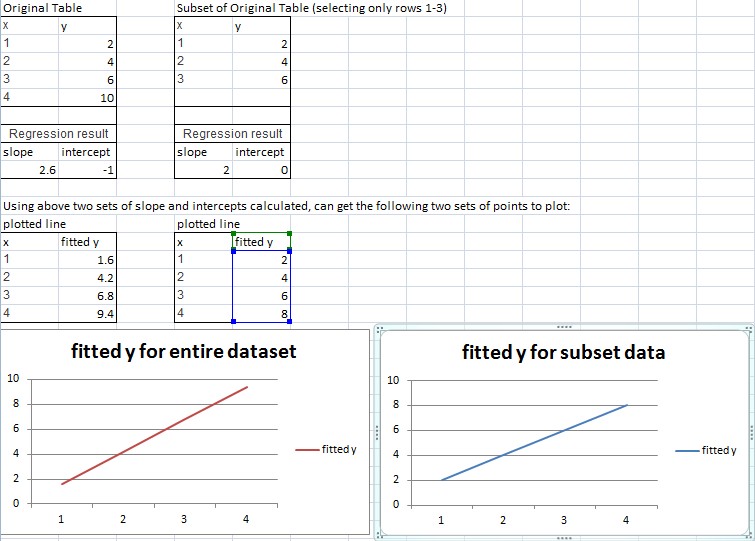
Suppose I have the following x and y values:
x y
1 2
2 4
3 6
4 10
A linear regression fit to these points will yield the line y=2.6x - 1. I'd like to plot that line. Then if I choose only the first three points (de-selecting the point (4,10)), the regression line will be y=2x. I'd like the plot then to change to THAT line. That is, the regression line plotted is modified on the fly as the user selects or de-selects subsets of the x,y pairs in the table.
I can easily get the equation for the line to change "on the fly" (meaning the values returned by the functions linest_m and linest_b change depending on the subsets of x,y pairs selected), but I can't figure out how to get the line displayed to change accordingly (that is, to depend on the x,y pairs selected and the corresponding linest_b and linest_m values returned).
Thanks for any thoughts.
- Mark as New
- Bookmark
- Subscribe
- Mute
- Subscribe to RSS Feed
- Permalink
- Report Inappropriate Content
Hello,
I'am not sure if i clear understand your needs. May you show (for example in xls) how should chart look like after few steps of user selections? If it is always 1 line, but with factors b and m calculated from selected points, you may use expression like this:
only({1}$(=LINEST_M(y,x))*x)+$(=LINEST_B(y,x))
regards
Darek
- Mark as New
- Bookmark
- Subscribe
- Mute
- Subscribe to RSS Feed
- Permalink
- Report Inappropriate Content
Thanks for your suggestions. I'll try to figure out how to apply it...where do I put the formula only({1}$(=LINEST_M(y,x))*x)+$(=LINEST_B(y,x)) for plotting the line? Does that just go in the usual line graph somewhere? Sorry to be so ignorant.
I've attached an image of an Excel worksheet that shows a dataset, a potential subset of that dataset that could be selected, and how I would like to see a plot change (full data displays one plot, selecting a subset of the data changes that plot to look like the second plot below (where the slope of the line is smaller).
Thanks for any further help!
- Mark as New
- Bookmark
- Subscribe
- Mute
- Subscribe to RSS Feed
- Permalink
- Report Inappropriate Content
Ok,
$(=LINEST_M(y,x)) give you M value for y,x pairs regardsing selection
$(=LINEST_B(y,x)) does the same with B value.
You should use this:
only({1}$(=LINEST_M(y,x))*x)+$(=LINEST_B(y,x))
as expression
in line chart having x as dimension.
regards
Darek
- Mark as New
- Bookmark
- Subscribe
- Mute
- Subscribe to RSS Feed
- Permalink
- Report Inappropriate Content
Thanks! That worked perfectly; I hadn't fully understood the need for $ to evaluate the expression. I also appreciate now the utility of the "only" and {1} uses which I hadn't realized before. Thank you, very helpful.
At the risk of pushing the limit here (and branching into a slightly different topic), as I'd originally mentioned I wanted to do a *weighted* regression, which I don't think is possible in QlikView (please correct me if wrong). Thus instead of plotting x and y as above, I want to plot a line fit to something like this (I shortened to only 3 possible values for the x axis here):
x y count
0 0 15
0 1 20
1 0 28
1 1 12
2 0 43
2 1 18
The count here represents how many records of x and y are represented (12 records having points (1,1) for example); thus the counts represent "weights" for each of the 6 records displayed above. Of course the 6 records above could be expanded out to be 15+20+28+12+43+18 total records, and a line fit to that using the LINEST_M and LINEST_B shown above, but it proves extremely inconvenient.
Alternatively I can "roll my own" weighted regression (calculate the weighted equivalent of LINEST_M and LINEST_B results). That requires (as one example step) that for each of the records above I be able to do something like:
sum(( x*y - sum(total x*y) )^2).
That is, I sum a calculation over 6 records, but each of those 6 calculations summed uses a single calculation obtained from the entire set selected,...the overall mean. In effect I'm doing sum( (xi - mean(x)) * (xi-mean(x)) ). The result of that calculation (and others like it) will give me my slope and intercept.
However, I don't know how/if I can do that calculation in an expression (in my chart). Basically, can I do a sum across records, where each value summed includes subtracting the overall mean from that individual value (and squaring)?
Sorry for the long-winded and complicated explanation. But I'm hoping for some suggestions on utilizing expressions in expressions, so to speak! Thank you.
- Mark as New
- Bookmark
- Subscribe
- Mute
- Subscribe to RSS Feed
- Permalink
- Report Inappropriate Content
I can see 3 or 4 ways.... 
1. Load rows as many times as count value (with while clause). In fact, taking into account QLikView compression it should be good solution if you dont have billion rows.
2. use own formulas for regression coefficients.
3. Use standard QlikView functions (linest_m,b...) - but first
"multiply number of lines on the fly" using data island and aggr it should be possible, but rather not fast with big data volumes.
4. aggregate data setting a new value of y for each row (or maybe even for each x)
regards
Darek
- « Previous Replies
-
- 1
- 2
- Next Replies »