Unlock a world of possibilities! Login now and discover the exclusive benefits awaiting you.
- Qlik Community
- :
- Forums
- :
- Analytics & AI
- :
- QlikView
- :
- Documents
- :
- Show negative values on Charts
- Subscribe to RSS Feed
- Mark as New
- Mark as Read
- Bookmark
- Subscribe
- Printer Friendly Page
- Report Inappropriate Content
Show negative values on Charts
- Mark as New
- Bookmark
- Subscribe
- Mute
- Subscribe to RSS Feed
- Permalink
- Report Inappropriate Content
Show negative values on Charts
Hi,
I have seen many posts on community for showing negative values on charts like Block chart, pie chart etc. There is a solution available on community, but I thought to create the document so that everyone can utilize the same.
Lets say I have below data set
LOAD * INLINE [
Country, Score
US, 4971.765
UK, 4782.54
Japan, -200.941
India, 1412.181
Russia, 2445.292
];
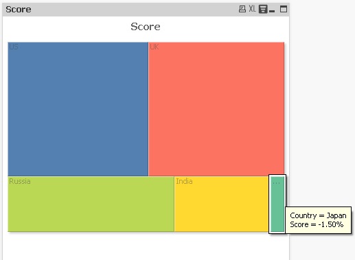
Now I want to create the Block chart with above data set. So create the block chart with dimension as country and expression as sum(Score) , as soon as you create the chart you will get the error message that "positive and negative values in chart". But you can still display the negative values on chart with slight modification in expression.
Steps to create the block chart with negative value
1) Create the block chart
Dimension : Country
Expression : dual(sum(Score),fabs(sum(Score)))
If you want to display the distribution in % then use below expression
dual(num(sum(Score)/sum(TOTAL Score),'#0.00%'),fabs(sum(Score)))
Using dual function you can display the negative value with the base as positive value.
2) Go to chart properties -> Number Tab and check the Number format setting always as "Expression default". If the number format setting is not the expression default then negative values will be displayed as positive and also data will be displayed in wrong format. So if you want to provide any format like %, money you can define in the Dual expression itself using num function
Please see the attached application. In this application I have used the Fast change option so that you can see the results for multiple chart type as well

see also,
Regards,
Kushal
- Mark as Read
- Mark as New
- Bookmark
- Permalink
- Report Inappropriate Content
Hi Kush,
Its a good trick , Expecting more like this from you, especially for beginner community.
- Mark as Read
- Mark as New
- Bookmark
- Permalink
- Report Inappropriate Content
Excellent trick...
- Mark as Read
- Mark as New
- Bookmark
- Permalink
- Report Inappropriate Content
Excellent
- Mark as Read
- Mark as New
- Bookmark
- Permalink
- Report Inappropriate Content
Nice Kush.. 
- Mark as Read
- Mark as New
- Bookmark
- Permalink
- Report Inappropriate Content
Good post dude.
- Mark as Read
- Mark as New
- Bookmark
- Permalink
- Report Inappropriate Content
Using dual() function to create a text representation that shows something different from the numeric value is indeed a useful technique and very helpful in several scenarios.
I am not sure if modifying a block or pie chart in this way is really useful, though. IMO, a pie chart or block chart shows parts of a total, and if the total is built from positive and negative values, there is a reason why Qlik refuses to create these kind of charts by default: It's hard for the user to understand the chart.
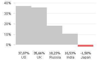
For example, just slightly changing your sample numbers results in this chart:
![2016-04-03 14_06_43-QlikView x64 - [C__Users_Stefan_Downloads_Negative values.qvw_].png](/legacyfs/online/120346_2016-04-03 14_06_43-QlikView x64 - [C__Users_Stefan_Downloads_Negative values.qvw_].png)
Users expect to get half of the pie when the percentage is 50%, don't you think so? And what does -25% indicate in such a representation?
You would get a correct absolute percentage with regard to slice are when using
=dual(num(sum(Score)/sum(TOTAL fabs(Score)),'#0.00%'),fabs(sum(Score)))
![2016-04-03 14_07_32-QlikView x64 - [C__Users_Stefan_Downloads_Negative values.qvw_].png](/legacyfs/online/120347_2016-04-03 14_07_32-QlikView x64 - [C__Users_Stefan_Downloads_Negative values.qvw_].png)
But still, it's hard to understand what this image should represent.
Maybe a bar chart would show the negative and positive values better.
Well, all above just my 0.02€, there might be scenarios where you want to use this approach even when using charts where it doesn't make sense in general, IMHO, I just don't see any.
If you do, I would be happy to see a use case.
Regards,
Stefan
- Mark as Read
- Mark as New
- Bookmark
- Permalink
- Report Inappropriate Content
You are correct swuehl. But there could be a scenario, where total need to be specific to considering the negative values as well to calculate the %. So in this case sum(TOTAL fabs(Score)) will not be helpful. Though here intention was just to show how we can display negative values on charts. Based on business need we can modify the expressions in dual function as we have flexibility to write the expression.
- Mark as Read
- Mark as New
- Bookmark
- Permalink
- Report Inappropriate Content
I also believe that a bar chart is easier to interpret and less confusing as swuehl suggests.
You can make it seem as a part of a whole by letting the bars stick together.
But my point being is that moest of the time you can solve problems by changing your visualisation.
And I believe in the cliché 'less is more'. The less different expressions, the less overhead the more you and your colleagues understand the app.
Though I can see some use cases in a table chart where you want to sort values by largest deviation and then you only need the fabs() function and not the dual().
But if someone has a use case I would also love to see it.
- Mark as Read
- Mark as New
- Bookmark
- Permalink
- Report Inappropriate Content
Hi,
Very helpful post 🙂
- Mark as Read
- Mark as New
- Bookmark
- Permalink
- Report Inappropriate Content
Excellent tip, thank you very much!