Unlock a world of possibilities! Login now and discover the exclusive benefits awaiting you.
- Qlik Community
- :
- All Forums
- :
- QlikView App Dev
- :
- 3 dimensional chart
- Subscribe to RSS Feed
- Mark Topic as New
- Mark Topic as Read
- Float this Topic for Current User
- Bookmark
- Subscribe
- Mute
- Printer Friendly Page
- Mark as New
- Bookmark
- Subscribe
- Mute
- Subscribe to RSS Feed
- Permalink
- Report Inappropriate Content
3 dimensional chart
hi guys,
i´m a newbie on qlikview and i need your help
for example if i have a excel file with rawdata. the fields are:
| id | country | used_function | #clicks |
|---|---|---|---|
| 01 | germany | write | 5 |
| 02 | spain | write | 4 |
| 03 | italy | read | 9 |
| 04 | usa | write | 8 |
| 05 | germany | read | 6 |
| 06 | portugal | read | 3 |
| 07 | italy | write | 11 |
| 08 | usa | read | 15 |
| 09 | france | read | 12 |
| 10 | germany | write | 4 |
| 11 | spain | read | 19 |
| 12 | usa | write | 15 |
| 13 | france | write | 2 |
| 14 | spain | read | 6 |
| 15 | germany | read | 9 |
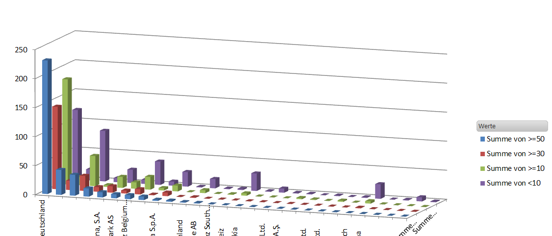
but there are alot more values in the tables. now i want to make a 3d bar chart with countries on the x-axis, sum of #clicks in the four intervals; x<5, x>=5 and <10, x>=10 and <15, x>=15 on the y-axis and the intervals itself as the z-axis.
sould look like this:
but if i try to rebuild the excelchart in qlikview it looks like this:
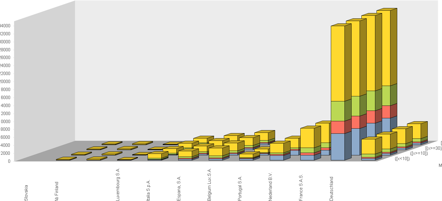
so my problem is that the rows are only duplicated. but for example i need the yellow bar in front position the blue bar in second position the green in third position
and the red one in last position and not stacked!!
hope you understand my problem and can help me!!!
Accepted Solutions
- Mark as New
- Bookmark
- Subscribe
- Mute
- Subscribe to RSS Feed
- Permalink
- Report Inappropriate Content
Sure, you can use a nested if statement:
if( x <10, 'x < 10',
if( x < 30, 'x >= and x < 30',
if( x < 50, 'x >= 30 and x < 50 ', 'x > 50')))
Or maybe you're looking for this.
talk is cheap, supply exceeds demand
- Mark as New
- Bookmark
- Subscribe
- Mute
- Subscribe to RSS Feed
- Permalink
- Report Inappropriate Content
A 3D bar chart is very colorful and flashy, but also very hard to read correctly. You're probably better off using the Trellis option. See attached qvw for a 3D chart and the trellis example.
talk is cheap, supply exceeds demand
- Mark as New
- Bookmark
- Subscribe
- Mute
- Subscribe to RSS Feed
- Permalink
- Report Inappropriate Content
I used the dimensions Country and the calculated dimension:
=Aggr(if(count(Click)<2,1,if(count(Click)<3,2,if(count(Click)<4,3,4))),Country)
And it worked right
What are your dimensions and expressions?
- Mark as New
- Bookmark
- Subscribe
- Mute
- Subscribe to RSS Feed
- Permalink
- Report Inappropriate Content
Another option is to use block chart, it is quite readable with three dimensions.
Regards,
Michael
- Mark as New
- Bookmark
- Subscribe
- Mute
- Subscribe to RSS Feed
- Permalink
- Report Inappropriate Content
is there another possibility instead of the class command? because i wanted to show x<10, x>=10 and x<30, x>=30 and <50, x>=50
with the class command i only have the choice between constant intervals, here i need to show interval=10, interval=20, intervall=20, and then the rest
- Mark as New
- Bookmark
- Subscribe
- Mute
- Subscribe to RSS Feed
- Permalink
- Report Inappropriate Content
Sure, you can use a nested if statement:
if( x <10, 'x < 10',
if( x < 30, 'x >= and x < 30',
if( x < 50, 'x >= 30 and x < 50 ', 'x > 50')))
Or maybe you're looking for this.
talk is cheap, supply exceeds demand
- Mark as New
- Bookmark
- Subscribe
- Mute
- Subscribe to RSS Feed
- Permalink
- Report Inappropriate Content
i found the solution to my problem!
i just add to the script:
If(#clicks<10, '<10', if(#clicks>=10 and #clicks<30,'>10 & <30', if (#clicks>=30 and #clicks<50,'>30 & <50','>50'))) as Interval
and then i use interval as my second dimension in the chart!!
- Mark as New
- Bookmark
- Subscribe
- Mute
- Subscribe to RSS Feed
- Permalink
- Report Inappropriate Content
i red your post to late 😄