Unlock a world of possibilities! Login now and discover the exclusive benefits awaiting you.
- Qlik Community
- :
- All Forums
- :
- QlikView App Dev
- :
- Re: Dynamically Changing the colour of the dimensi...
- Subscribe to RSS Feed
- Mark Topic as New
- Mark Topic as Read
- Float this Topic for Current User
- Bookmark
- Subscribe
- Mute
- Printer Friendly Page
- Mark as New
- Bookmark
- Subscribe
- Mute
- Subscribe to RSS Feed
- Permalink
- Report Inappropriate Content
Dynamically Changing the colour of the dimension axis label
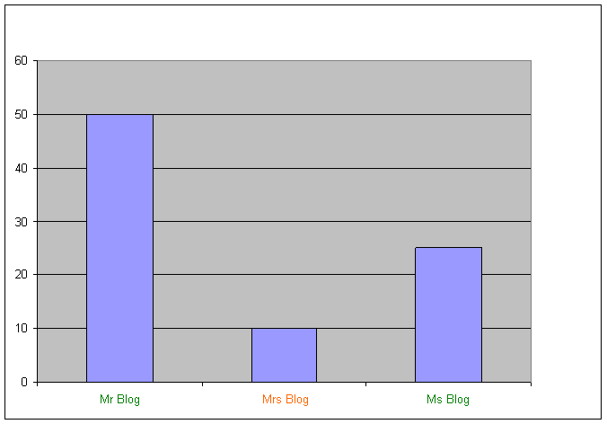
I have two tables that show some values, for example
Table 1 - Stats Table 2 - Current People
Name Qty Name Current
Mr Blog 50 Mr Blog 1
Mrs Blog 10 Ms Blog 1
Ms Blog 25
I want the Graph to show the label text colour to Green if they are current and orange if they are not, for example
I used the Axis Font Colour to have the following formula:
IF(Sum (Current)>0, RGB(24,117,11),RGB(241,111,14))
But this only does the colour for the whole graph, not for each individual bar.
How do I make it work for each bar?
- « Previous Replies
-
- 1
- 2
- Next Replies »
- Mark as New
- Bookmark
- Subscribe
- Mute
- Subscribe to RSS Feed
- Permalink
- Report Inappropriate Content
I think the custom color expression for the font of the axis labels is calculated once.
Also, it likely neglects chart dimensions.
So, unfortunately, you have to use another tools to provide this info to user.
- Mark as New
- Bookmark
- Subscribe
- Mute
- Subscribe to RSS Feed
- Permalink
- Report Inappropriate Content
Thankyou very much,
Andrew Sheward
Business Support Analyst,
Contact Strategy and Operational Analytics Development
Business Development Improvement and Risk
Retail Banking Operations
Business Services
Royal Bank of Scotland Group
4th Floor, Kendal Court, Telford, TF3 4DT
(Depot Code 034)
External Tel: +44 1952 206572
Internal Tel: 8171 6572
DATA CLASSIFICATION: unless otherwise stated the information contained
within this email is CONFIDENTIAL
- Mark as New
- Bookmark
- Subscribe
- Mute
- Subscribe to RSS Feed
- Permalink
- Report Inappropriate Content
I have the solution, using Chart Properties:
1. In General menu, choose "Combo Chart"
2. In Dimensions menu, disable "Show legend"
3. In Expression menu, in addition to the expression Qty using the sum, you have to add another expression with the following definition: =only(name). Now, enable "Invisible" and disable in Display options "line" and enable "Text on axis".
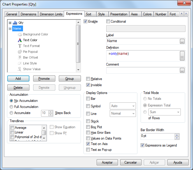
Then, in "Text Color" you can put the definition: =if(current=1,RGB(24,117,11),RGB(241,111,14))

And now you have what you want.
- Mark as New
- Bookmark
- Subscribe
- Mute
- Subscribe to RSS Feed
- Permalink
- Report Inappropriate Content
Answer is not relevant to the question
- Mark as New
- Bookmark
- Subscribe
- Mute
- Subscribe to RSS Feed
- Permalink
- Report Inappropriate Content
I am looking the get Bold in the weened dates in a drill down dimension
Environment Bar chart, Groped staked
Dims
First dim is drill down as below
Month_year
Week
Date
Second dim is the grouped indicator to get the staked bar grouped
How do I get the Bold weekend dates in the X axis when value drill to the date level
Paul
- « Previous Replies
-
- 1
- 2
- Next Replies »