Unlock a world of possibilities! Login now and discover the exclusive benefits awaiting you.
- Qlik Community
- :
- All Forums
- :
- QlikView App Dev
- :
- From Pivottable to diagram - formel problem
- Subscribe to RSS Feed
- Mark Topic as New
- Mark Topic as Read
- Float this Topic for Current User
- Bookmark
- Subscribe
- Mute
- Printer Friendly Page
- Mark as New
- Bookmark
- Subscribe
- Mute
- Subscribe to RSS Feed
- Permalink
- Report Inappropriate Content
From Pivottable to diagram - formel problem
Dear experts,
I think that I have simple problem: I have a pivottable. Each column contains a formel.
I have data from Jan - to Mai. Another columns are forecast-values (yellow).
Now I want to show this values in diagram. Existing values from Jan to Mai are displayed. Column from Jun to Dec are not displayed like in the pivottable
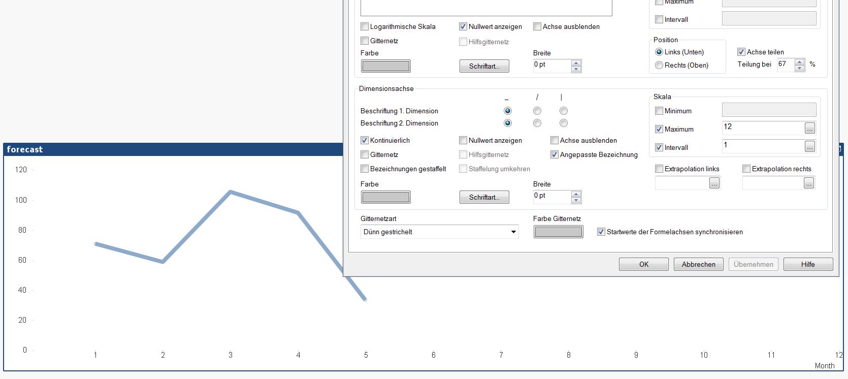
In the axis I show the month with interval ( Max: 12).
How I can display the formel for each Month in the diagram ?

- Mark as New
- Bookmark
- Subscribe
- Mute
- Subscribe to RSS Feed
- Permalink
- Report Inappropriate Content
Hi André,
Can you post a copy of your application/chart for us to see?
Thanks.
- Mark as New
- Bookmark
- Subscribe
- Mute
- Subscribe to RSS Feed
- Permalink
- Report Inappropriate Content
Hi Ciaran,
thank you for your reply. In the attachment you will find the same example with other values.
My problem is to show the forecast(avg) values for future month in the diagram.
- Mark as New
- Bookmark
- Subscribe
- Mute
- Subscribe to RSS Feed
- Permalink
- Report Inappropriate Content
The issue with your chart is that you are using Month as your Dimension, but there are no Months for 5, 6, 7 so your expression won't work.
if(Monat=7 will never be greater than 0 if the 7th month doesn't exist and
sum(Stunden)/count(DISTINCT(Monat)) won't appear on the chart as there is no Month to map the Expression to the Dimension.
I'm not sure where to even start here, for the line chart, you should only be using one expression as each one will create a single point, independent from the previous one. As for the FC months, you will need to read up on Forecast (found in the Axis tab).
- Mark as New
- Bookmark
- Subscribe
- Mute
- Subscribe to RSS Feed
- Permalink
- Report Inappropriate Content
Thank you for your reply. Yes, it is correct.
In the properties --> Axis I found "continuous" --> Max = 12 and interval = 1.
But I still don't know, how I can show forecast(avg) values for the month 6-12
ask for support
- Mark as New
- Bookmark
- Subscribe
- Mute
- Subscribe to RSS Feed
- Permalink
- Report Inappropriate Content
The problem was solved by mastercalender + formel: If(Month < Month(Today()), Sum($(vStd)), Rangesum(Above($(vAVG) , 0, RowNo())) + Avg({1}0) )