Unlock a world of possibilities! Login now and discover the exclusive benefits awaiting you.
- Qlik Community
- :
- All Forums
- :
- QlikView App Dev
- :
- Re: How to build bar chart showing % of parts that...
- Subscribe to RSS Feed
- Mark Topic as New
- Mark Topic as Read
- Float this Topic for Current User
- Bookmark
- Subscribe
- Mute
- Printer Friendly Page
- Mark as New
- Bookmark
- Subscribe
- Mute
- Subscribe to RSS Feed
- Permalink
- Report Inappropriate Content
How to build bar chart showing % of parts that make up one bar
I'm sure this is possible and has probably been discussed here before but I'm striking out with all my search terms.
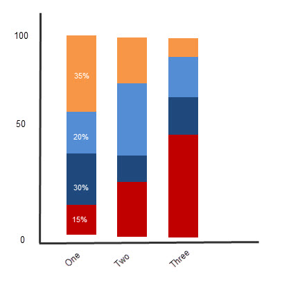
I want to build a bar chart (suggest another format if there is a more suitable one) that shows one bar for each category and within the category it would show the % of items that fell within one of 4 different time ranges. As this is sometimes hard to explain with words, I've attached a very crude prototype to show you what I mean.
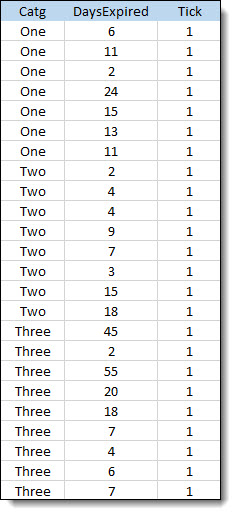
The categories are on x axis. The y axis represent the % of the total number of items. Each colored rectangle in the bars represents the % of total items for that category that fell within last 7, 14, 21 and >21 days. For this example, let's say data model has the following fields and values
Any help would be greatly appreciated.
Thanks
Accepted Solutions
- Mark as New
- Bookmark
- Subscribe
- Mute
- Subscribe to RSS Feed
- Permalink
- Report Inappropriate Content
Clever's answer would be correct if you could simply use two dimensions. Just to elaborate on why it works, the TOTAL operator tells QlikView to look across all dimensions and come up with a total value. The <Category> bit says get a separate total for each of the values in the Category dimension.
However, as the values you are grouping by are not in the data source, but are rather derived from it you need to do a bit more work. You can have as the second dimension, this:
=Class(DaysExpired, 7)
Or better still you can put this into the load script and derive the value there, this would look like this:
Class(DaysExpired, 7) as Group,
The legends for the buckets is not particularly tidy, but you can use a replace function to sort that out if required. You just need to be careful to treat the group as a dual, the code would read like this:
Dual(replace(Class(DaysExpired, 7), '<= x <', 'to'), Class(DaysExpired, 7)) as Group
I've attached an example where the replace is done in a preceding load.
Hope that helps.
Steve
- Mark as New
- Bookmark
- Subscribe
- Mute
- Subscribe to RSS Feed
- Permalink
- Report Inappropriate Content
Forgot to mention, the % numbers I show in first bar doesn't have to be part of the final chart. I just put that there to make it easier for me to illustrate what the smaller boxes that make up the bar represent
- Mark as New
- Bookmark
- Subscribe
- Mute
- Subscribe to RSS Feed
- Permalink
- Report Inappropriate Content
Add two dimentions Catg and Itens
Use something like
sum(Tick) / sum( TOTAL <Category> Tick) as expression
- Mark as New
- Bookmark
- Subscribe
- Mute
- Subscribe to RSS Feed
- Permalink
- Report Inappropriate Content
How about this example.
SUM(Tick)/SUM(Total <Catg> Tick)
See attached solution.
Kind regards
Niklas Hedborg
- Mark as New
- Bookmark
- Subscribe
- Mute
- Subscribe to RSS Feed
- Permalink
- Report Inappropriate Content
See attached. you have to introduce a new field for your 7,14,21 & >21 days logic. you find that in script in attached file.
- Mark as New
- Bookmark
- Subscribe
- Mute
- Subscribe to RSS Feed
- Permalink
- Report Inappropriate Content
Wow, thanks for the quick replies. They were all really helpful. Wish I could give you all "Correct Answer" status.
- Mark as New
- Bookmark
- Subscribe
- Mute
- Subscribe to RSS Feed
- Permalink
- Report Inappropriate Content
Clever's answer would be correct if you could simply use two dimensions. Just to elaborate on why it works, the TOTAL operator tells QlikView to look across all dimensions and come up with a total value. The <Category> bit says get a separate total for each of the values in the Category dimension.
However, as the values you are grouping by are not in the data source, but are rather derived from it you need to do a bit more work. You can have as the second dimension, this:
=Class(DaysExpired, 7)
Or better still you can put this into the load script and derive the value there, this would look like this:
Class(DaysExpired, 7) as Group,
The legends for the buckets is not particularly tidy, but you can use a replace function to sort that out if required. You just need to be careful to treat the group as a dual, the code would read like this:
Dual(replace(Class(DaysExpired, 7), '<= x <', 'to'), Class(DaysExpired, 7)) as Group
I've attached an example where the replace is done in a preceding load.
Hope that helps.
Steve