Unlock a world of possibilities! Login now and discover the exclusive benefits awaiting you.
- Qlik Community
- :
- All Forums
- :
- QlikView
- :
- Advise on visualization
- Subscribe to RSS Feed
- Mark Topic as New
- Mark Topic as Read
- Float this Topic for Current User
- Bookmark
- Subscribe
- Mute
- Printer Friendly Page
- Mark as New
- Bookmark
- Subscribe
- Mute
- Subscribe to RSS Feed
- Permalink
- Report Inappropriate Content
Advise on visualization
Hi all, I have a table in the data model with the following fields:
Date Sales Discount Profit etc......
2016-12-01 9003 64 8104
2016-12-02 4902 311 4590
etc...
I want to create a visualization that has the following design:
(the user must select 1 week, for ex. Wk 50)
KPI Wk 49 Wk 50 % Inc
Sales 2415 5322 230%
Discount 642 344 53%
Profit
etc...
What is the best way to achieve this, ie having the expression on the left as a column?
Do you need to create an additional table in the Script?
Do you use pivot or straight table?
Thanks a lot for your help.
Jon
- « Previous Replies
-
- 1
- 2
- Next Replies »
Accepted Solutions
- Mark as New
- Bookmark
- Subscribe
- Mute
- Subscribe to RSS Feed
- Permalink
- Report Inappropriate Content
For your expected output it's not like we could have expressions to aggregate against dimensions , because you want KPI's also the headers are a mix of Period(week) and % and a custom period (LY week) so we are better off with a straight table
attaching sample app for reference.
If a post helps to resolve your issue, please accept it as a Solution.
- Mark as New
- Bookmark
- Subscribe
- Mute
- Subscribe to RSS Feed
- Permalink
- Report Inappropriate Content
You need to do a crosstable load, refer the below link
The load script for sample you provided will be like
Crosstable(KPI,Amount,1)
Load *
FROM YourSource;
Now Create a MasterCalendar for your date field , to have week, month,year,ytd of whatever flags you wish to visualize your data by
Better Calendar Scripts | Qlikview Cookbook
If a post helps to resolve your issue, please accept it as a Solution.
- Mark as New
- Bookmark
- Subscribe
- Mute
- Subscribe to RSS Feed
- Permalink
- Report Inappropriate Content
Thanks Vineeth, Thanks for your suggestion. Is there another way to achieve the objective. If possible I would try to avoid the crosstable as it will complicate the data model, in order to have the considerable number of tables linked properly. Would something like this work, if create a table like the below in the data model, and use this table in a straight table? KPITable: Load Inline KPI Sales Discount Net Profit etc..
- Mark as New
- Bookmark
- Subscribe
- Mute
- Subscribe to RSS Feed
- Permalink
- Report Inappropriate Content
I think Crosstable will simplify things for you
Otherwise you will need to have separate expressions for Each KPI and checked to Horizontal
Whereas with cross table you can create a pivottable with Week and KPI as Dimension and Sum(Amount) as the ONLY Expression .
your choice, multiple expressions or single expression.
If a post helps to resolve your issue, please accept it as a Solution.
- Mark as New
- Bookmark
- Subscribe
- Mute
- Subscribe to RSS Feed
- Permalink
- Report Inappropriate Content
Thanks Vineeth, Can you post a sample QVW of the above options if that is possible? I would like to try out both examples if you can assist me with that please? Thanks
- Mark as New
- Bookmark
- Subscribe
- Mute
- Subscribe to RSS Feed
- Permalink
- Report Inappropriate Content
See attached
If a post helps to resolve your issue, please accept it as a Solution.
- Mark as New
- Bookmark
- Subscribe
- Mute
- Subscribe to RSS Feed
- Permalink
- Report Inappropriate Content
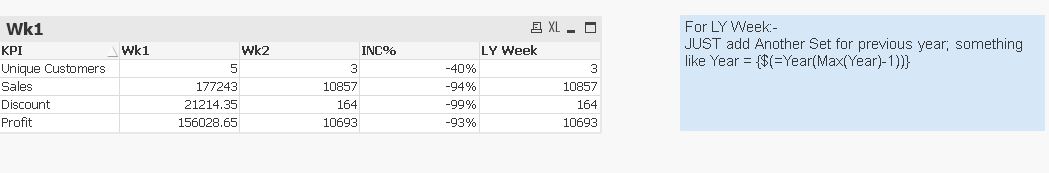
Lovely example Vineeth, Can you make the CrossTable work if you want for to show for ex. No of unique customers, or CrossTable work for sum only?
- Mark as New
- Bookmark
- Subscribe
- Mute
- Subscribe to RSS Feed
- Permalink
- Report Inappropriate Content
Crosstable is used to Normalize a Crosstabbed Pivot table, which is what your data is like
We've basically un-pivoted your data, so the resultant table is the IDEAL table to work with.
You can use Count(Distinct Customer) or whatever you want
If a post helps to resolve your issue, please accept it as a Solution.
- Mark as New
- Bookmark
- Subscribe
- Mute
- Subscribe to RSS Feed
- Permalink
- Report Inappropriate Content
That's what I was thinking, but if you have just one expression sum(Amount) in the crosstable, can you please let me know how to user count( distinct amount ) or other types of aggregations for the respective kpi? Thanks for your patience
- Mark as New
- Bookmark
- Subscribe
- Mute
- Subscribe to RSS Feed
- Permalink
- Report Inappropriate Content
Can you upload some sample data and expected output, i'll try to recreate
If a post helps to resolve your issue, please accept it as a Solution.
- « Previous Replies
-
- 1
- 2
- Next Replies »