Unlock a world of possibilities! Login now and discover the exclusive benefits awaiting you.
- Qlik Community
- :
- All Forums
- :
- QlikView
- :
- Re: Advise on visualization
- Subscribe to RSS Feed
- Mark Topic as New
- Mark Topic as Read
- Float this Topic for Current User
- Bookmark
- Subscribe
- Mute
- Printer Friendly Page
- Mark as New
- Bookmark
- Subscribe
- Mute
- Subscribe to RSS Feed
- Permalink
- Report Inappropriate Content
Advise on visualization
Hi all, I have a table in the data model with the following fields:
Date Sales Discount Profit etc......
2016-12-01 9003 64 8104
2016-12-02 4902 311 4590
etc...
I want to create a visualization that has the following design:
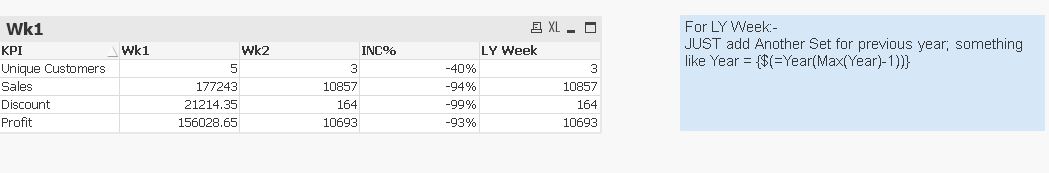
(the user must select 1 week, for ex. Wk 50)
KPI Wk 49 Wk 50 % Inc
Sales 2415 5322 230%
Discount 642 344 53%
Profit
etc...
What is the best way to achieve this, ie having the expression on the left as a column?
Do you need to create an additional table in the Script?
Do you use pivot or straight table?
Thanks a lot for your help.
Jon
- « Previous Replies
-
- 1
- 2
- Next Replies »
- Mark as New
- Bookmark
- Subscribe
- Mute
- Subscribe to RSS Feed
- Permalink
- Report Inappropriate Content
Yes of course.
I uploaded the Excel file with Data tab and Expected tab to give an idea of my expected layout.
- Mark as New
- Bookmark
- Subscribe
- Mute
- Subscribe to RSS Feed
- Permalink
- Report Inappropriate Content
you could try flippping it
KPI Wk 49 Wk 50 % Inc
Sales 2415 5322 230%
Discount 642 344 53%
Profit
etc...
ie Sales / Discount / Profit / %inc
wk49
wk50
with expression for every category (sales / discount etc)
and a dimension for weeks (in script)
SENSE
and then flip using a pivot table drag measure to the first column and weeks to the columns
View this can be done using a straight table
presentation --> Horizontal
- Mark as New
- Bookmark
- Subscribe
- Mute
- Subscribe to RSS Feed
- Permalink
- Report Inappropriate Content
Thanks, I'll check and get back to you
If a post helps to resolve your issue, please accept it as a Solution.
- Mark as New
- Bookmark
- Subscribe
- Mute
- Subscribe to RSS Feed
- Permalink
- Report Inappropriate Content
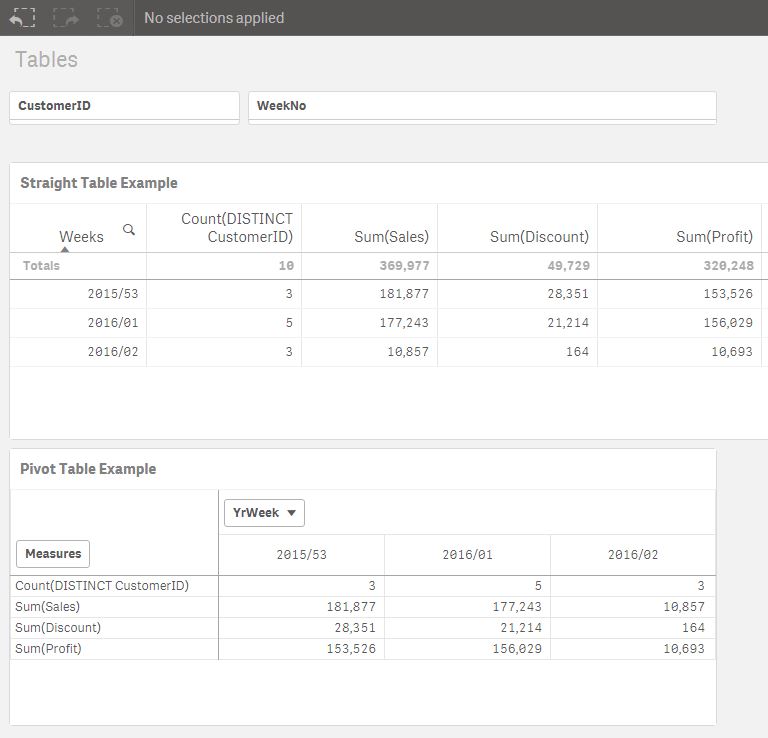
Hi
Maybe I missing the point ...
why don't you do it like this (as suggested above)
This is 15 minutes work. Getting the %var would be a bit longer. It could be done in script or in a chart
DATA:
LOAD
"Date",
WeekName(Date) as YrWeek , //
WeekNo,
text (CustomerID) as CustomerID,
Company,
Sales,
Discount,
Profit
FROM [lib://QlikSenseOther/CrosstabbingForum.xlsx]
(ooxml, embedded labels, table is Data);
and the output in Sense (the same can be done in View using a straight table. You could use your weekNum or as I have done)
but with measures renamed of course
to include the %inc something like this (or use peek)
DATA2:
Load
RowNo() AS ROW ,
YrWeek,
SUM (Sales) AS SalesWk ,
sum(Discount) as DiscountWk ,
sum(Profit) as ProfitWk
resident DATA
GROUP BY YrWeek
//ORDER BY YrWeek
;
data3:
Load
ROW,
SalesWk as Temp ,
previous (SalesWk) as SalesPrevWk ,
previous (DiscountWk) as DiscountPrevWk
resident DATA2 ;
//order by YrWeek ;
//====================================================
Or using peek (NB peek based on output / previous based on input)
DATA2:
Load
RowNo() AS ROW ,
YrWeek,
SUM (Sales) AS SalesWk ,
sum(Discount) as DiscountWk ,
sum(Profit) as ProfitWk ,
peek ('SalesWk', -1,'DATA2') as SalesPrevWk //etc likewise discount and profit
resident DATA
GROUP BY YrWeek
ORDER BY YrWeek
;
- Mark as New
- Bookmark
- Subscribe
- Mute
- Subscribe to RSS Feed
- Permalink
- Report Inappropriate Content
and if you want a more complex but slick way of doing it look at thsi thread
- Mark as New
- Bookmark
- Subscribe
- Mute
- Subscribe to RSS Feed
- Permalink
- Report Inappropriate Content
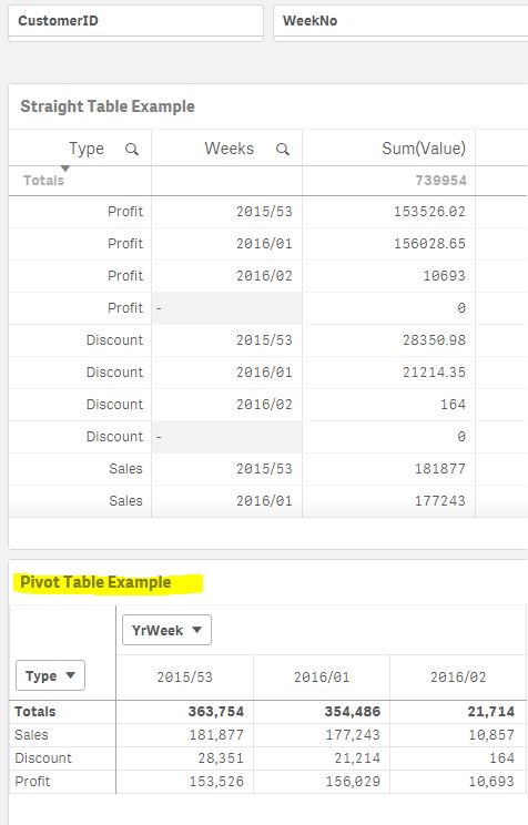
I also had a go with the cross-table approach
Its an alternative way but I would just use the the 4 expressions
If it was me I would show them the non cross-table script load and straight table format
but with this the Pivot Table looks tidier (although with total turned off). But if presentation was key maybe look at the above post
DATA:
LOAD
Dual('Sales',1) as Type ,
"Date",
WeekName(Date) as YrWeek ,
WeekNo,
text (CustomerID) as CustomerID,
Company,
Sales as Value
// Discount,
// Profit
FROM [lib://QlikSenseOther/CrosstabbingForum.xlsx]
(ooxml, embedded labels, table is Data);
DATA:
concatenate (DATA)
LOAD
dual ('Discount',2) as Type ,
"Date",
WeekName(Date) as YrWeek ,
WeekNo,
text (CustomerID) as CustomerID,
Company,
// Sales,
Discount as Value
// Profit
FROM [lib://QlikSenseOther/CrosstabbingForum.xlsx]
(ooxml, embedded labels, table is Data);
DATA:
Concatenate (DATA)
LOAD
dual ('Profit',3) as Type ,
"Date",
WeekName(Date) as YrWeek ,
WeekNo,
text (CustomerID) as CustomerID,
Company,
// Sales,
// Discount as Value
Profit as Value
FROM [lib://QlikSenseOther/CrosstabbingForum.xlsx]
(ooxml, embedded labels, table is Data);
- Mark as New
- Bookmark
- Subscribe
- Mute
- Subscribe to RSS Feed
- Permalink
- Report Inappropriate Content
Hi,
you can try with value list you will get,
add calculated dim:- valuelist(Unique Customer,sales,discount,Profit)
expr's:-
1) for wk49:-
if(valuelist(Unique Customer,sales,discount,Profit)='Unique Customer','write hereucs expr',
if(valuelist(Unique Customer,sales,discount,Profit)='sales','sales expr',
if(valuelist(Unique Customer,sales,discount,Profit)='discount','discountexpr',etc)))
2) for wk50:-
if(valuelist(Unique Customer,sales,discount,Profit)='Unique Customer','write hereucs expr',
if(valuelist(Unique Customer,sales,discount,Profit)='sales','sales expr',
if(valuelist(Unique Customer,sales,discount,Profit)='discount','discountexpr',etc)))
3) % Inc:-
if(valuelist(Unique Customer,sales,discount,Profit)='Unique Customer','write hereucs expr',
if(valuelist(Unique Customer,sales,discount,Profit)='sales','sales expr',
if(valuelist(Unique Customer,sales,discount,Profit)='discount','discountexpr',etc)))
....like
Regards,
- Mark as New
- Bookmark
- Subscribe
- Mute
- Subscribe to RSS Feed
- Permalink
- Report Inappropriate Content
For your expected output it's not like we could have expressions to aggregate against dimensions , because you want KPI's also the headers are a mix of Period(week) and % and a custom period (LY week) so we are better off with a straight table
attaching sample app for reference.
If a post helps to resolve your issue, please accept it as a Solution.
- « Previous Replies
-
- 1
- 2
- Next Replies »