Unlock a world of possibilities! Login now and discover the exclusive benefits awaiting you.

- Qlik Community
- :
- All Forums
- :
- QlikView
- :
- Re: Bar in table chart
- Subscribe to RSS Feed
- Mark Topic as New
- Mark Topic as Read
- Float this Topic for Current User
- Bookmark
- Subscribe
- Mute
- Printer Friendly Page

 felcar2013
- Mark as New
- Bookmark
- Subscribe
- Mute
- Subscribe to RSS Feed
- Permalink
- Report Inappropriate Content
Bar in table chart
hi
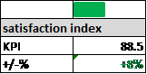
is it possible to get exactly the box below in qlikview? i think with the mini-chart option
the KPI can be any number or indicator, the +/-% a change from this point to a previous period. I think that should be possible, but as pivot table? not as table diagram, right?
what i do not how to do, is how to place the bar chart there? It shall be green if it is positive and red if it is negative (the +/-% field)
Is it possible to put the bar in the first row? and then the title? any help will be very welcome
felipe
- « Previous Replies
-
- 1
- 2
- Next Replies »
felcar2013
- Mark as New
- Bookmark
- Subscribe
- Mute
- Subscribe to RSS Feed
- Permalink
- Report Inappropriate Content
many thanks
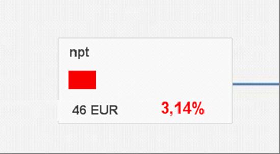
nice solution, but i would need two boxes for the same KPI? we tried to put text boxes over a bar chart and got what is in the figure. the difficulty is when moving the KPI boxes, but visually it contains what we wanted
i think it is not sustainable in the long term
thanks for your help again

- Mark as New
- Bookmark
- Subscribe
- Mute
- Subscribe to RSS Feed
- Permalink
- Report Inappropriate Content
Hi Gysbert,
How you can add a dimension with the ValueList.
Example Negative/Positive bar by Country.
Thank you
felcar2013
- Mark as New
- Bookmark
- Subscribe
- Mute
- Subscribe to RSS Feed
- Permalink
- Report Inappropriate Content
Hi,
go please in your Chart to dimensions, then click on "Add Calculated Dimensions" and type in the function ..
ValueList('value1,'value2') and thats it
in your Expression you can refer to the value list Dimension, say, if(ValueList('value1','value2')=value1, 'do something','else')
- « Previous Replies
-
- 1
- 2
- Next Replies »