Unlock a world of possibilities! Login now and discover the exclusive benefits awaiting you.
- Qlik Community
- :
- All Forums
- :
- QlikView
- :
- Re: Bold cell
- Subscribe to RSS Feed
- Mark Topic as New
- Mark Topic as Read
- Float this Topic for Current User
- Bookmark
- Subscribe
- Mute
- Printer Friendly Page
- Mark as New
- Bookmark
- Subscribe
- Mute
- Subscribe to RSS Feed
- Permalink
- Report Inappropriate Content
Bold cell
Hello everybody.
I want to bold colom in my pivot table but I'm not arrive to do.
I explain in my join document what i want exactly.
Can you help me to have this results?
Thank you for your help...
- « Previous Replies
-
- 1
- 2
- Next Replies »
- Mark as New
- Bookmark
- Subscribe
- Mute
- Subscribe to RSS Feed
- Permalink
- Report Inappropriate Content
Hi,
Use capitalize ( ) function.
Regards
Anand
- Mark as New
- Bookmark
- Subscribe
- Mute
- Subscribe to RSS Feed
- Permalink
- Report Inappropriate Content
Hi,
Ok you want to bold the column so for this go to
Properties -> Style -> Select Basic and apply setting.
HTH
Rgds
Anand
- Mark as New
- Bookmark
- Subscribe
- Mute
- Subscribe to RSS Feed
- Permalink
- Report Inappropriate Content
Hi Anand,
Thank you for your help but its not what I want! I'm sorry
I dont have the good results with your indication...
Other idea??
- Mark as New
- Bookmark
- Subscribe
- Mute
- Subscribe to RSS Feed
- Permalink
- Report Inappropriate Content
in expression-> click on + sign which before expression name
go to text format and type ='<B>'
or you can try this
properties-> visual Qubes->select column or filed and check on bold which is on bottom
- Mark as New
- Bookmark
- Subscribe
- Mute
- Subscribe to RSS Feed
- Permalink
- Report Inappropriate Content
Hi,
Do this changes first.
Go to Settings -> User preference -> Design -> Check "Always Show Design Menu Item"
Click OK.
Go to the Chart Right Click on Cell... You will find the Option Named. "Custom Format Cell"
Change the settings as per your need.
Regards,
Kaushik Solanki
- Mark as New
- Bookmark
- Subscribe
- Mute
- Subscribe to RSS Feed
- Permalink
- Report Inappropriate Content
Hi,
I tried all your proposition but any give me the good results...
Any idea???
thank you...
- Mark as New
- Bookmark
- Subscribe
- Mute
- Subscribe to RSS Feed
- Permalink
- Report Inappropriate Content
sample file
- Mark as New
- Bookmark
- Subscribe
- Mute
- Subscribe to RSS Feed
- Permalink
- Report Inappropriate Content
See my first message for Excel file or this image...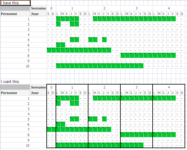
- Mark as New
- Bookmark
- Subscribe
- Mute
- Subscribe to RSS Feed
- Permalink
- Report Inappropriate Content
I don't kow if it is possible to do this in one single chart, I doubt it, but If it is impossible to do this, I have a solution / work around that will work: You can create 4 charts (one chart for each week) and put them next to each other, and use layers (so that the dimension column is hidden behind the top layer) -> you will get a similar result, after some hard work... Regards, Robert
- « Previous Replies
-
- 1
- 2
- Next Replies »