Unlock a world of possibilities! Login now and discover the exclusive benefits awaiting you.
- Qlik Community
- :
- All Forums
- :
- QlikView
- :
- Re: Google Maps - Heatmap
- Subscribe to RSS Feed
- Mark Topic as New
- Mark Topic as Read
- Float this Topic for Current User
- Bookmark
- Subscribe
- Mute
- Printer Friendly Page
- Mark as New
- Bookmark
- Subscribe
- Mute
- Subscribe to RSS Feed
- Permalink
- Report Inappropriate Content
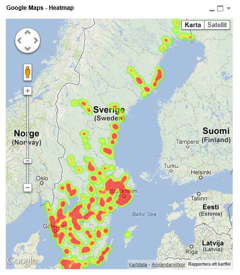
Google Maps - Heatmap
Google Maps Extension with Heatmap support.
QlikTech takes no responsibility for any code and QlikTech Support Agreement does not cover issues with this extension.
Please review Googles license agreement before you put this into production.
Big thanks to pablolabbe for contributing to the project.
Download
mindspank/GoogleMaps-Heatmap-QV11 · GitHub
Introduction
A new addition to the Google Maps family. This extensions will take your data points and produce a heatmap on top of a Google Map.
A good tool easily spot areas with higher intensity of data points. There is no selection support for this extension has there is no markers available at the moment.
You can either use the extension 'as is' or use it as a base to further customize it to fit your needs.
2013-12-14
Finally tracked down the errors when you tried to pass in faulty data.
Less DOM-calls.
2013-06-04
Added a check that QV passes valid data points to Google. If you are passing an invalid data point it will log it to the console in your browser.
Also enabled weighted data points. Now the weight if your data point in the heatmap will correspond to your expression value. If you want equal weight between the points, e.g the original heatmap where the number of data points determined your heat level, set a arbitrary value of =1
If you build something awesome please share it with the community!
Live long and prosper.
- Tags:
- extension
- extension_object
- full-web mapping extension for qlikview and sense
- geospatial
- google map
- heatmap
- heatmaps
- map
- qlikview extensions
- qlikview_extensions
- Mark as New
- Bookmark
- Subscribe
- Mute
- Subscribe to RSS Feed
- Permalink
- Report Inappropriate Content
I would love to build something for Route optimization. However it soon becomes overly complex and you are most likely better off investing in a professional route optimization tool. Should we avoid highways? Is tool booths okey? Does it take into account congestion in traffic etc etc
For the most basic needs I always recommend Matthew Crowther's 'flow map' which works great when display flow between different points, which could be a route for example where the line could represent value on that route.
You can check it out on New Qlikview Chart Type: Dynamic Network Flow Charts | QVDesign
- Mark as New
- Bookmark
- Subscribe
- Mute
- Subscribe to RSS Feed
- Permalink
- Report Inappropriate Content
Hi Alex,
How to add Text layer in it ?
- Mark as New
- Bookmark
- Subscribe
- Mute
- Subscribe to RSS Feed
- Permalink
- Report Inappropriate Content
Hi Alexander,
Thanks for the suggestion, route map is really too complicated.
By the way, i tried to show heatmap but seems like not working (it is working fine previously).
May I know what step I might miss?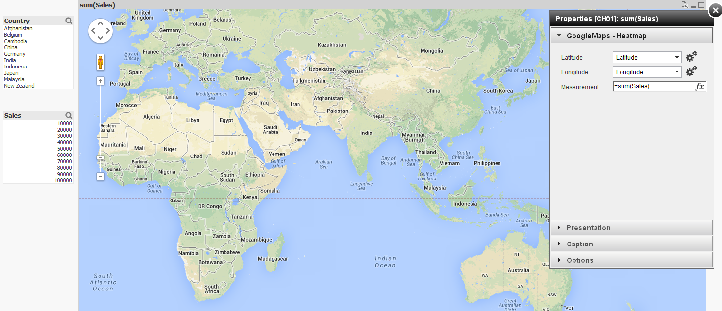
Thanks and best regards,
Chanel
- Mark as New
- Bookmark
- Subscribe
- Mute
- Subscribe to RSS Feed
- Permalink
- Report Inappropriate Content
After upgrading to QV 11.2 SR3 this morning the Google Map now shows for me - however - no "heat map" is showing - see screen shot below.
I have selected my Latitude and Longitude columns and the expression. These work in a normal generated Google Map - but not in this extension. Any ideas?
Thanks,
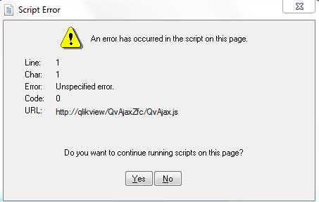
I also get this error:

- Mark as New
- Bookmark
- Subscribe
- Mute
- Subscribe to RSS Feed
- Permalink
- Report Inappropriate Content
Hey there people,
First, GREAT EXTENSION (seriosuly)
Anyhow, I was wondering if it was possible to consider absolute values while generating the heatmap and not relative to total. The reason for this being that I have a globally scattered data set and visualization is quite hard. Any other "trick" that might help me give more weight to the points would help. Thanks!
Also, Are you planning to add an extension where one can add polylines any time soon? because that would save my life bro. Thanks a lot!
- Mark as New
- Bookmark
- Subscribe
- Mute
- Subscribe to RSS Feed
- Permalink
- Report Inappropriate Content
Hey,
The weight of every marker should not be relative but an absolute value. What changes depending on the expression, or weight, is the intensity in the heatmap and not the radius. You could try it by entering a rand() * 1000 as expression and you will see the different intensity.
It would however also be interesting to maybe control the radius of each marker in the heatmap to also have a metric to control the size of the heat area. But then again maybe just circles/squares that scales their radius depending on a expression might do the trick instead. Heck, I'll make one of those also 
I would love to make a polyline version!
However it's only 2 points you want to plot I would recommend this solution which is all native QlikView,
New Qlikview Chart Type: Dynamic Network Flow Charts | QVDesign
But if you want to make a stream of polylines that have several markers within a single line I can look into how much work it would be to do with Google Maps.
For example:
Line 1: Point A > Point B > Point C
Line 2: Point A > Point X > Point Z > Point A
Should be straightforward to code, it's more of a hassle to create a data model that can hold that kind of logic in a good way I guess.
- Mark as New
- Bookmark
- Subscribe
- Mute
- Subscribe to RSS Feed
- Permalink
- Report Inappropriate Content
Alex, thanks for the reply. I was kind of confused about the nature of heatmaps. What I still dont understand, is why having the expression set at 1,000,000 produces the exact same map as having the expression set at 0.01. I think the radius would help a lot!. Also, having a single point with expression set at infinity, I don't know why, produces only a light green gradient in the map, and that doesnt work for me... I think I might be switching to your "clustergooglemap" for this aplication (though heatmaps are way cooler) .
What about styling the map? so light green heat doesn't get confused with the map. And by the way.. how do you make all this extensions? 
Regarding the polylines, I did what was done in the example but the output was not nice, since I have to graph about 200 polylines, and zooming in is necessary. Polylines with geodesic=true would be ideal. If you happen to build one of those I would very much appreciate it  .
.
- Mark as New
- Bookmark
- Subscribe
- Mute
- Subscribe to RSS Feed
- Permalink
- Report Inappropriate Content
From what I've been experimenting, the size of the radius of a given point is relative to the zoom level the map beggins with. This means, a point has a radius, and this one keeps constant as you zoom in/out (provided you dont "merge" with other other points). The thing is, when you have have only one point, the map starts with a zoom on the given point, and as you zoom out you keep the same size. but then, if you have 2 points sepparated enough, the map loads "zoomed out", and you dont get to appreciate the values as you could if you kept the zoom level constant.
For example:
First I filter to one point my map, and set expression = 1000, and get the following:
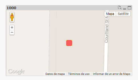 After zooming out:
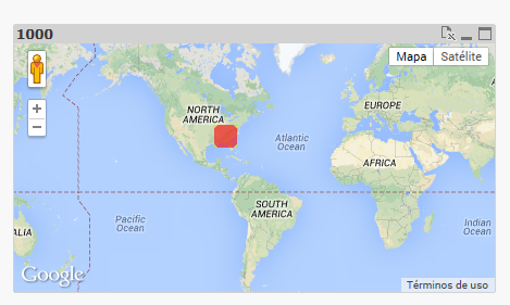
Then I load 4 points, scattered across the globe. I get this:
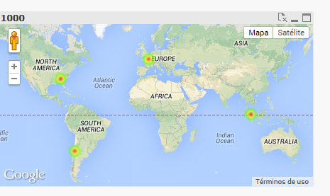
you can then see then how the point in the US shrunk.
- Mark as New
- Bookmark
- Subscribe
- Mute
- Subscribe to RSS Feed
- Permalink
- Report Inappropriate Content
Thanks for this great work!
- Mark as New
- Bookmark
- Subscribe
- Mute
- Subscribe to RSS Feed
- Permalink
- Report Inappropriate Content
Is there any way to put markers on the heat map? I have a requirement to color boundaries of the countries and put markers on office locations.
Thanks