Unlock a world of possibilities! Login now and discover the exclusive benefits awaiting you.

- Qlik Community
- :
- All Forums
- :
- QlikView
- :
- Grid chart
- Subscribe to RSS Feed
- Mark Topic as New
- Mark Topic as Read
- Float this Topic for Current User
- Bookmark
- Subscribe
- Mute
- Printer Friendly Page

- Mark as New
- Bookmark
- Subscribe
- Mute
- Subscribe to RSS Feed
- Permalink
- Report Inappropriate Content
Grid chart
Hi all,
my aim is to plot the Avg(km) and Avg(Seniority) of some veichles according to two variables:
1) the satisfaction level: a four level variable ranging from "very dissatisfied (overall 1-4)" to "very satisfied (overall 9-10)"
2) the contribution achieved: a three level variable meaning: "complete reimbursement"; "partial reimbursement"; "no reimbursed"
I would have a graph like the following:
- Y= seniority
- X= km
Points in the chart define the average km and seniority for the i-group. Each group is reppresented by the two variable explained before (satisfaction level and contribution achieved).
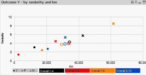
I get the chart by creating three different chart, one for each contribution level. But it is not working properly. Enclosed a qvw example to better understand my point:
1) i.e., how can I set my chart so that cases with a very low satisfaction (overall 1-4) should be reppresented with black colour? Should I specify this requirement in the expressions property or in the dimension one? In the example exnclosed it seems that only the colour tab is the driver, but I don't like that.
2) Is there a way to get the same result with one single chart?
Thank you for your help!
All the best (and happy new year!!!)
Sabrina