Unlock a world of possibilities! Login now and discover the exclusive benefits awaiting you.
Announcements
Now accepting applications for the Qlik Luminary and Partner Ambassador Programs: Apply by July 6!
- Qlik Community
- :
- All Forums
- :
- QlikView
- :
- Re: How to create Gatt
Options
- Subscribe to RSS Feed
- Mark Topic as New
- Mark Topic as Read
- Float this Topic for Current User
- Bookmark
- Subscribe
- Mute
- Printer Friendly Page
Turn on suggestions
Auto-suggest helps you quickly narrow down your search results by suggesting possible matches as you type.
Showing results for
Anonymous
Not applicable
2017-04-18
06:08 PM
- Mark as New
- Bookmark
- Subscribe
- Mute
- Subscribe to RSS Feed
- Permalink
- Report Inappropriate Content
How to create Gatt
Hi all,
I have a data like this
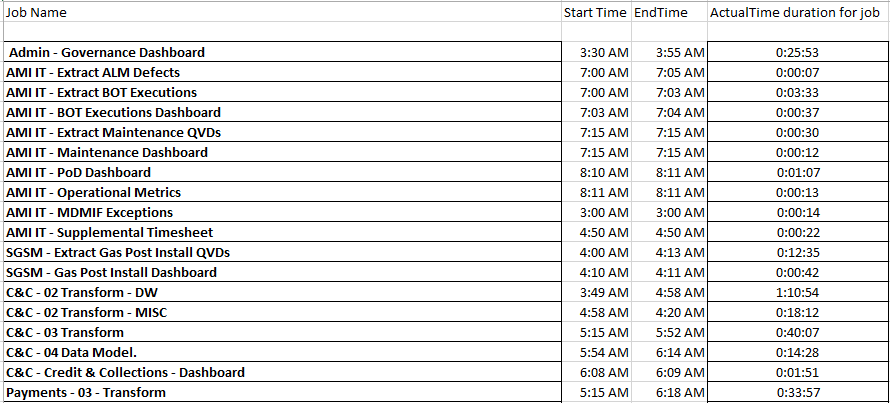
I want to create a gantt chart
For x-axis time line with 30 minutes interval
Y-axis Job name with average and actual duration. How can i create gantt chart based on these requirement
Could anyone help me out for this secanario
Regards,
Vijay.M
586 Views
2 Replies
Not applicable
2017-04-18
06:42 PM
Author
- Mark as New
- Bookmark
- Subscribe
- Mute
- Subscribe to RSS Feed
- Permalink
- Report Inappropriate Content
Hi Vijay.M,
In case you didn't know, check out this design blog. I hope it helps you.
Warm regards,
Nish
505 Views
Anonymous
Not applicable
2017-04-19
10:22 AM
Author
- Mark as New
- Bookmark
- Subscribe
- Mute
- Subscribe to RSS Feed
- Permalink
- Report Inappropriate Content
I want to display x axis in 30 minutes interval from 3.00 AM to 10.00 AM how can i bring it in expression
505 Views