Unlock a world of possibilities! Login now and discover the exclusive benefits awaiting you.

- Qlik Community
- :
- All Forums
- :
- QlikView
- :
- Implementing Bar Chart with Uniquely Grouped Dimen...
- Subscribe to RSS Feed
- Mark Topic as New
- Mark Topic as Read
- Float this Topic for Current User
- Bookmark
- Subscribe
- Mute
- Printer Friendly Page

 makximenkoa
- Mark as New
- Bookmark
- Subscribe
- Mute
- Subscribe to RSS Feed
- Permalink
- Report Inappropriate Content
Implementing Bar Chart with Uniquely Grouped Dimensions
Hello,
I am attempting to recreate this bar chart that was originally made in excel. The chart has 3 different expressions for each column showing a 6 month avg, a summed total for previous month, and a summed total for current month. The chart is stacked by the financial class (denoted by orange, grey, and yellow).
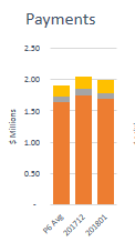
I was able to get this far with the below three expressions but I am not sure how to go about implementing the dimensions so that it shows the same type of stacked bar chart above. When I add my desired dimension to the chart, I either get each expression for each value in the dimension, or I get the 3 expressions stacked for each dimension value.
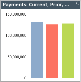
Expression 1 (blue): =num(sum({<_M={6,5,4,3,2,1}>} [Payments])/6,'$#,##0')
Expression 2 (red): =sum({<_M={6}>} [Payments])
Expression 3 (green): =sum({<_M={7}>} [Payments])
Any help towards recreating the first chart would be greatly appreciated!
Accepted Solutions

 jwjackso
- Mark as New
- Bookmark
- Subscribe
- Mute
- Subscribe to RSS Feed
- Permalink
- Report Inappropriate Content
I created a dimension called period, you would want to use members from your calendar.
Per:
LOAD * Inline [
Per
'PG Avg'
'201712'
'201801'
];
Data:
LOAD * Inline [
FinClass,Mth,Amt
1,6,100
1,5,100
1,4,100
1,3,100
1,2,100
1,1,105
1,7,100
2,7,50
2,6,50
2,5,50
2,4,50
2,3,50
2,2,50
2,1,50
3,7,25
3,6,25,
3,5,25
];
The chart expressions uses an IF statement:
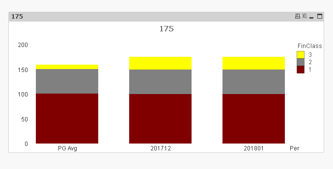
=If(Per = 'PG Avg',Sum({<Mth={'6','5','4','3','2','1'}>} Amt)/6,If(Per='201712',Sum({<Mth={'6'}>} Amt),Sum({<Mth={'7'}>} Amt)))
The Background Color definition:
=If(FinClass = 1,Red(),If(FinClass = 2,DarkGray(),Yellow()))
jwjackso
- Mark as New
- Bookmark
- Subscribe
- Mute
- Subscribe to RSS Feed
- Permalink
- Report Inappropriate Content
I created a dimension called period, you would want to use members from your calendar.
Per:
LOAD * Inline [
Per
'PG Avg'
'201712'
'201801'
];
Data:
LOAD * Inline [
FinClass,Mth,Amt
1,6,100
1,5,100
1,4,100
1,3,100
1,2,100
1,1,105
1,7,100
2,7,50
2,6,50
2,5,50
2,4,50
2,3,50
2,2,50
2,1,50
3,7,25
3,6,25,
3,5,25
];
The chart expressions uses an IF statement:
=If(Per = 'PG Avg',Sum({<Mth={'6','5','4','3','2','1'}>} Amt)/6,If(Per='201712',Sum({<Mth={'6'}>} Amt),Sum({<Mth={'7'}>} Amt)))
The Background Color definition:
=If(FinClass = 1,Red(),If(FinClass = 2,DarkGray(),Yellow()))
makximenkoa
- Mark as New
- Bookmark
- Subscribe
- Mute
- Subscribe to RSS Feed
- Permalink
- Report Inappropriate Content
Perfect, thank you!
