Unlock a world of possibilities! Login now and discover the exclusive benefits awaiting you.

- Qlik Community
- :
- All Forums
- :
- QlikView
- :
- Re: Label Alignment on Stacked Bar chart
- Subscribe to RSS Feed
- Mark Topic as New
- Mark Topic as Read
- Float this Topic for Current User
- Bookmark
- Subscribe
- Mute
- Printer Friendly Page

- Mark as New
- Bookmark
- Subscribe
- Mute
- Subscribe to RSS Feed
- Permalink
- Report Inappropriate Content
Label Alignment on Stacked Bar chart
I'm struggling with getting the labels on my bar chart to appear where they are supposed to be.
What's right: values on data points at top of each bar show total of each bar
Whats not: 2nd expression added to show text on axis for % of each bar relative to total of all bars is showing multiple times (once for each value in the secondary dimension maybe?) and the values are staggered locations, i want them to just be at the bottom of each bar.
Primary dimension labels shifted off to the right when i added the 2nd expression for text on axis.
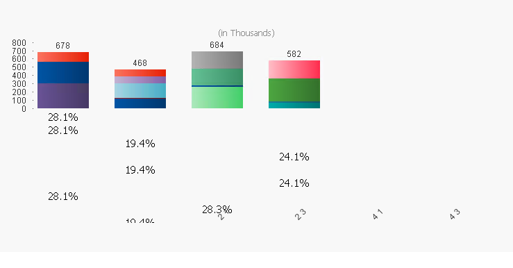
Does anyone know what i'm doing wrong? Sample doc attached.
Accepted Solutions

 Gysbert_Wassena
- Mark as New
- Bookmark
- Subscribe
- Mute
- Subscribe to RSS Feed
- Permalink
- Report Inappropriate Content
Since you're using two dimensions you will get a Text on Axis row for each value of the second dimension. They're staggered because they're all different SKU values so they all get the Text on Axis value on a different row. There's nothing you can do about that except disabling the Text on Axis option. If you need those percentages shown then you'll have to use a second chart and put the two charts on top of each other, with the top chart having a transparent background.
talk is cheap, supply exceeds demand
Gysbert_Wassena- Mark as New
- Bookmark
- Subscribe
- Mute
- Subscribe to RSS Feed
- Permalink
- Report Inappropriate Content
Since you're using two dimensions you will get a Text on Axis row for each value of the second dimension. They're staggered because they're all different SKU values so they all get the Text on Axis value on a different row. There's nothing you can do about that except disabling the Text on Axis option. If you need those percentages shown then you'll have to use a second chart and put the two charts on top of each other, with the top chart having a transparent background.
talk is cheap, supply exceeds demand