Unlock a world of possibilities! Login now and discover the exclusive benefits awaiting you.

- Qlik Community
- :
- All Forums
- :
- QlikView
- :
- Re: Multi Color Stacked Bar chart
- Subscribe to RSS Feed
- Mark Topic as New
- Mark Topic as Read
- Float this Topic for Current User
- Bookmark
- Subscribe
- Mute
- Printer Friendly Page

- Mark as New
- Bookmark
- Subscribe
- Mute
- Subscribe to RSS Feed
- Permalink
- Report Inappropriate Content
Multi Color Stacked Bar chart
Hello,
I am new to qlikview and currently working on a requirement to represent data as shown in attached snap shot.
In attached snap shot 2 bars are representing 2 metrics.and no dimensions used
1. Available Hours = Sum of Non-Chargeable + Sum of Chargeable Hours
2. Stacked bar chart of Non-Chargeable and Chargeable Hours.
Is there a way to achieve such chart?
- Tags:
- bar_chart_background
- barcharts
- chart background color
- clusterchart
- color format for bar chart
- multicolorbarchart
- new to qlikview
- new_to_qlikview
- stackedbarchart
Accepted Solutions

 swuehl
- Mark as New
- Bookmark
- Subscribe
- Mute
- Subscribe to RSS Feed
- Permalink
- Report Inappropriate Content
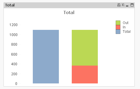
To create your total and your detailed bar, you can do something like this:
Create a synthetic dimension like
=ValueList('1','2')
Then three expressions:
=If(ValueList('1','2')= 1, Rangesum(Sum(Value1), Sum(Value2) ) )
=If(ValueList('1','2')= 2, Sum(Value1) )
=If(ValueList('1','2')= 2, Sum(Value2) )
You can hide the dimension label on dimension tab and then set style to stacked on presentation tab.

 engishfaque
- Mark as New
- Bookmark
- Subscribe
- Mute
- Subscribe to RSS Feed
- Permalink
- Report Inappropriate Content
Dear Pradeep,
For stack chart, kindly follow the listed below steps:
Chart Properties > Style Tab > Subtype > Select "Stacked" radio button > Apply > OK.
Kind regards,
Ishfaque Ahmed


- Mark as New
- Bookmark
- Subscribe
- Mute
- Subscribe to RSS Feed
- Permalink
- Report Inappropriate Content
Please send the qvw file. So that, We can respond back and easy to monitor also....
- Mark as New
- Bookmark
- Subscribe
- Mute
- Subscribe to RSS Feed
- Permalink
- Report Inappropriate Content
Hello Ishfaque,
Thanks for your response. However, my requirement is different here.
I have 2 metrics displaying in the form of bars.
1st bar in the chart indicates metrics 1 (=sum({<[HT] = {'Available'}>}Hours) ).
2nd bar indicates metric 2. But metric 2 aggregation is based on a conditional aggregation. (=sum({<[HT] = {'Non Chargeable','Chargeable'}>}Hours) ).
As metric 1 is derived from a single condition , there needs to be only one color for bar.
But since metric 2 is derived based on 2 values , we need 2nd bar in 2 colors.
Thanks,
Pradeep
swuehl
- Mark as New
- Bookmark
- Subscribe
- Mute
- Subscribe to RSS Feed
- Permalink
- Report Inappropriate Content
To create your total and your detailed bar, you can do something like this:
Create a synthetic dimension like
=ValueList('1','2')
Then three expressions:
=If(ValueList('1','2')= 1, Rangesum(Sum(Value1), Sum(Value2) ) )
=If(ValueList('1','2')= 2, Sum(Value1) )
=If(ValueList('1','2')= 2, Sum(Value2) )
You can hide the dimension label on dimension tab and then set style to stacked on presentation tab.

 HirisH_V7
- Mark as New
- Bookmark
- Subscribe
- Mute
- Subscribe to RSS Feed
- Permalink
- Report Inappropriate Content
Hi,
By using the sample data,
Data:
LOAD * INLINE [
    Non-Chargeble, Chargeable
    1, 2
    2, 1
    4, 2
];
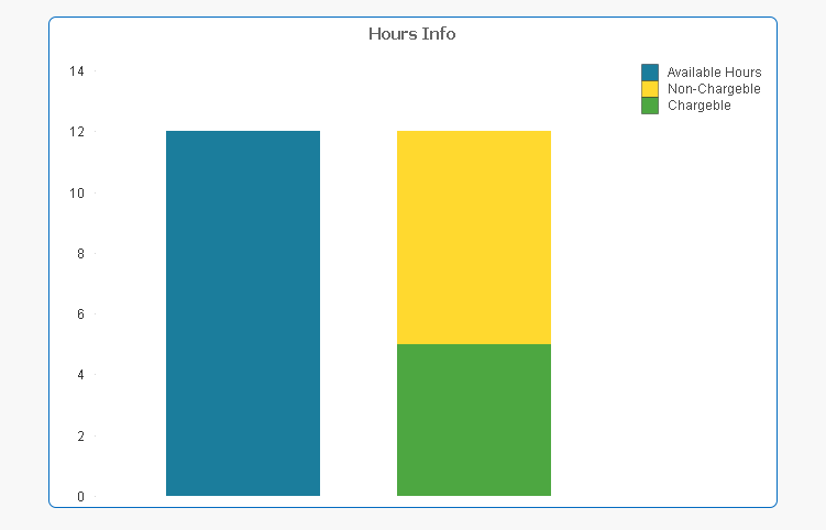
Creating a stacked bar chart using ,
Dimension:-
=ValueList(1,2)
Expressions:-
If(Valuelist(1,2)=2,Sum(Chargeable))

If(Valuelist(1,2)=2,Sum([Non-Chargeble]))

If(Valuelist(1,2)=1,Sum(Chargeable)+Sum([Non-Chargeble]))
stacked chart will look like this,
HTH,
PFA,
Hirish
- Mark as New
- Bookmark
- Subscribe
- Mute
- Subscribe to RSS Feed
- Permalink
- Report Inappropriate Content
Thanks alot Wuehl. This is what i needed. And i followed the approach you mentioned and it is working as expected.
Thanks alot again.