Unlock a world of possibilities! Login now and discover the exclusive benefits awaiting you.

Announcements
Share your agentic AI experience, learn from others, and earn a new badge: Put Agentic AI to Work
- Qlik Community
- :
- All Forums
- :
- QlikView
- :
- Period Comparison on a chart using Calendar Object...
Options
- Subscribe to RSS Feed
- Mark Topic as New
- Mark Topic as Read
- Float this Topic for Current User
- Bookmark
- Subscribe
- Mute
- Printer Friendly Page
Turn on suggestions
Auto-suggest helps you quickly narrow down your search results by suggesting possible matches as you type.
Showing results for

Anonymous
Not applicable
2017-11-27
05:52 AM
- Mark as New
- Bookmark
- Subscribe
- Mute
- Subscribe to RSS Feed
- Permalink
- Report Inappropriate Content
Period Comparison on a chart using Calendar Objects
Hello All,
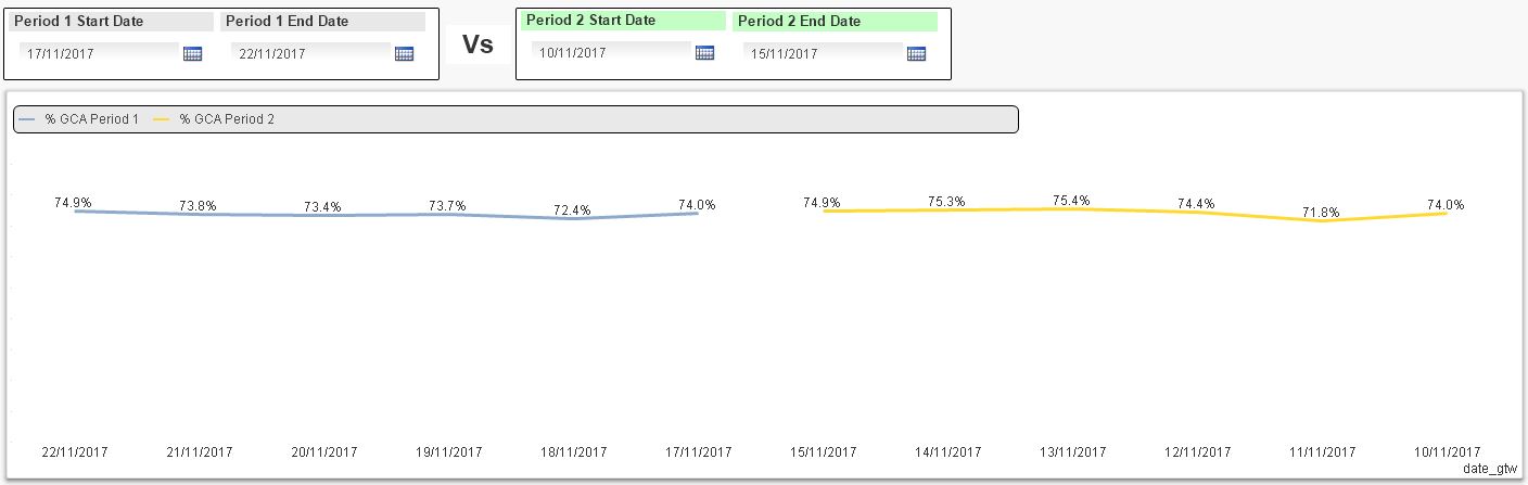
Im trying to compare the trend of a metric, on a line chart, across 2 different time periods.
The x axis will have dates and the y-axis will have the metric.
The issues that im trying to resolve are the following:
- When i select 2 date periods, with "the same" number of days, from the object calendars i would like to see 2 lines on the chart, one below the other, and not one next to the other (see image below)
- When i select 2 date periods, with "different" number of days, from the object calendars i would like to see 2 lines on the chart, one below the other, where the start dates from both date periods will be in the same vertical line (start from the same point in x axis)
This may require some VB programming code. Any help will be much appreciated.
898 Views
0 Replies