Unlock a world of possibilities! Login now and discover the exclusive benefits awaiting you.

- Qlik Community
- :
- All Forums
- :
- QlikView
- :
- Re: Scatter chart
- Subscribe to RSS Feed
- Mark Topic as New
- Mark Topic as Read
- Float this Topic for Current User
- Bookmark
- Subscribe
- Mute
- Printer Friendly Page

 syukyo_zhu
- Mark as New
- Bookmark
- Subscribe
- Mute
- Subscribe to RSS Feed
- Permalink
- Report Inappropriate Content
Scatter chart
Hi,
I wanted to create a chart to show price changes over the time.
I used scatter chart. In the simple case, as shown in my first example below: point to point
I have an article, in early2015 it was $ 60, after the first change, it becomes 50 in late March, and down to 40 at the end of 2015.
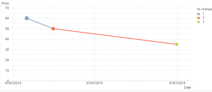
But in somes cases complex, I can observe different prices for the same date as shown in my another example: point to multipoints
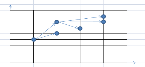
So how can I do? anyone have idea about it.
Thanks
- Tags:
- chart
- scatte_chart

 sinanozdemir
- Mark as New
- Bookmark
- Subscribe
- Mute
- Subscribe to RSS Feed
- Permalink
- Report Inappropriate Content
Hi,
Can you post some sample data? It seems like you should be able to do it with a scatter chart.
Thanks
 luciancotea
- Mark as New
- Bookmark
- Subscribe
- Mute
- Subscribe to RSS Feed
- Permalink
- Report Inappropriate Content
Why don't you use CandleStick chart, which is the appropriate visualization for your kind of data?
syukyo_zhu
- Mark as New
- Bookmark
- Subscribe
- Mute
- Subscribe to RSS Feed
- Permalink
- Report Inappropriate Content
Hi,
below some sample data.
Case simple
LOAD * INLINE [
Date, Article, Price, nb change
31/01/2015, A1, 59.9, 1
31/03/2015, A1, 49.9, 2
31/12/2015, A1, 34.9, 3
];
Case complexe
LOAD * INLINE [
Date, Article, Price, nb change
31/01/2015, A1, 59.9, 1
31/03/2015, A1, 49.9, 2
31/12/2015, A1, 34.9, 3
31/12/2015, A1, 54.9, 3
];
sinanozdemir
- Mark as New
- Bookmark
- Subscribe
- Mute
- Subscribe to RSS Feed
- Permalink
- Report Inappropriate Content
What if you concatenate these two tables and then pull all the distinct values? As a result of this, you will have a cleaner data model to work with:
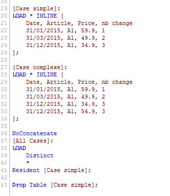
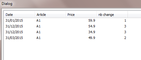
What do you think?
syukyo_zhu
- Mark as New
- Bookmark
- Subscribe
- Mute
- Subscribe to RSS Feed
- Permalink
- Report Inappropriate Content
we have a lots of articles, i don't know werthere CandleStick chart is appropriate for us.
Do you have un sample about CandleStick chart
syukyo_zhu
- Mark as New
- Bookmark
- Subscribe
- Mute
- Subscribe to RSS Feed
- Permalink
- Report Inappropriate Content
How can you show these datas in scatter chart?
sinanozdemir
- Mark as New
- Bookmark
- Subscribe
- Mute
- Subscribe to RSS Feed
- Permalink
- Report Inappropriate Content
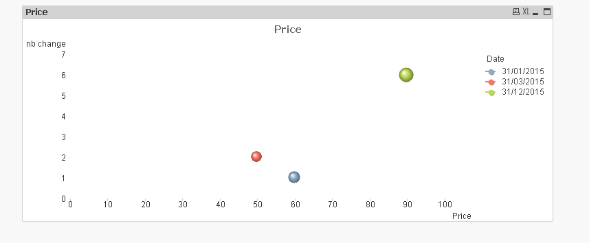
Yeah, showing the dates is not pretty:
syukyo_zhu
- Mark as New
- Bookmark
- Subscribe
- Mute
- Subscribe to RSS Feed
- Permalink
- Report Inappropriate Content
Thanks sinan,
But i want to show data in scratte chart non bulles chart.
