Unlock a world of possibilities! Login now and discover the exclusive benefits awaiting you.

- Qlik Community
- :
- All Forums
- :
- QlikView
- :
- Scatter plot as graphic timetable
Options
- Subscribe to RSS Feed
- Mark Topic as New
- Mark Topic as Read
- Float this Topic for Current User
- Bookmark
- Subscribe
- Mute
- Printer Friendly Page
Turn on suggestions
Auto-suggest helps you quickly narrow down your search results by suggesting possible matches as you type.
Showing results for

Anonymous
Not applicable
2017-11-20
03:26 AM
- Mark as New
- Bookmark
- Subscribe
- Mute
- Subscribe to RSS Feed
- Permalink
- Report Inappropriate Content
Scatter plot as graphic timetable
Hey,
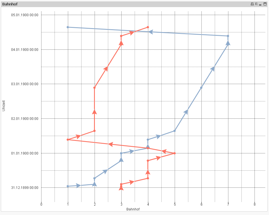
I tried to recreate a graphic timetable in qlik, using a scatter plot. (German: Bildfahrplan – Wikipedia). I am already very close to what I would like it to be, but now I have two problems:
1) I'd like to reverse thy y-axis (to make the time running from top to bottom)
2) I'd like to replace the labels on the x-axis - the stations' names instead of numbers. I already tried to use the 'dual'-function, but that did not work.
I attached the qlik file and some exemplary data.
585 Views
0 Replies