Unlock a world of possibilities! Login now and discover the exclusive benefits awaiting you.

- Qlik Community
- :
- All Forums
- :
- QlikView
- :
- Re: Top three values per month
- Subscribe to RSS Feed
- Mark Topic as New
- Mark Topic as Read
- Float this Topic for Current User
- Bookmark
- Subscribe
- Mute
- Printer Friendly Page

- Mark as New
- Bookmark
- Subscribe
- Mute
- Subscribe to RSS Feed
- Permalink
- Report Inappropriate Content
Top three values per month
I'm trying to build a bar chart (using a standard Qlik sense component or the Picassa extension).
I need 3 bars PER MONTH that represent my top 3 categories per month based on total revenue of that category.
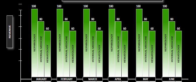
While my sample chart does not show it, the top 3 categories will be different every month.
Best I can tell, I need to make 3 data series
=Dual(Aggr( If(Rank(Sum(REVENUE))=1, CATEGORY_NAME), MonthYear, PHY_SPEC_DESCR),
Sum( Aggr( If(Rank(Sum(REVENUE))=1, Sum(REVENUE)), MonthYear, CATEGORY_NAME))
)
=Dual(Aggr( If(Rank(Sum(REVENUE))=2 CATEGORY_NAME), MonthYear, PHY_SPEC_DESCR),
Sum( Aggr( If(Rank(Sum(REVENUE))=2, Sum(REVENUE)), MonthYear, CATEGORY_NAME))
)
=Dual(Aggr( If(Rank(Sum(REVENUE))=3, CATEGORY_NAME), MonthYear, PHY_SPEC_DESCR),
Sum( Aggr( If(Rank(Sum(REVENUE))=3, Sum(REVENUE)), MonthYear, CATEGORY_NAME))
)
Is there a simpler way to do this? I'm not confident that I'm getting the right data out.
Thanks, Mark
Accepted Solutions

 BalaBhaskar_Qli
- Mark as New
- Bookmark
- Subscribe
- Mute
- Subscribe to RSS Feed
- Permalink
- Report Inappropriate Content
May be try like this:
BalaBhaskar_Qli- Mark as New
- Bookmark
- Subscribe
- Mute
- Subscribe to RSS Feed
- Permalink
- Report Inappropriate Content
May be try like this: