Unlock a world of possibilities! Login now and discover the exclusive benefits awaiting you.

- Qlik Community
- :
- All Forums
- :
- QlikView
- :
- Re: Unusual chart request
- Subscribe to RSS Feed
- Mark Topic as New
- Mark Topic as Read
- Float this Topic for Current User
- Bookmark
- Subscribe
- Mute
- Printer Friendly Page

 hobanwashburne
- Mark as New
- Bookmark
- Subscribe
- Mute
- Subscribe to RSS Feed
- Permalink
- Report Inappropriate Content
Unusual chart request
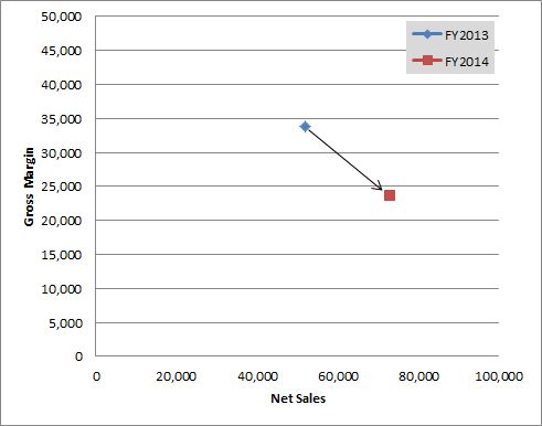
A senior manager has asked me if I can put together a QV application that would display the following chart for a given selected customer:
X Axis = Net Sales
Y Axis = Gross Margin
2 Data points: FY2013 & FY2014
and if possible a line connecting the two with an arrow indicating the trend direction
I am confident that I can calculate the two values, but it is unclear to me how to format in such a way that QV displays the desired result. Does anyone have an example of something similar?
Accepted Solutions

 maxgro
- Mark as New
- Bookmark
- Subscribe
- Mute
- Subscribe to RSS Feed
- Permalink
- Report Inappropriate Content
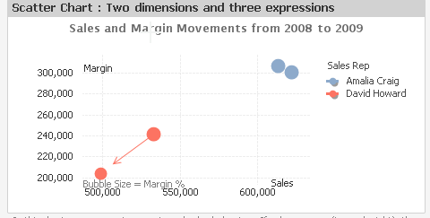
in your Qlik installation folder, look for Data Visualization.qvw
there is an example, this

- Mark as New
- Bookmark
- Subscribe
- Mute
- Subscribe to RSS Feed
- Permalink
- Report Inappropriate Content
Do no about the line but the rest of it should be a simple scatter plot if you have aggregated values for FY.
Regards
R

 kuba_michalik
- Mark as New
- Bookmark
- Subscribe
- Mute
- Subscribe to RSS Feed
- Permalink
- Report Inappropriate Content
Seems doable with a scatter chart, example attached. Key is, you need two dimensions in chart. First would be year, second is something else (customer for example) - if you need only one line, it can be a calculated dimension with a constant value. Now I know what those options were for 
maxgro
- Mark as New
- Bookmark
- Subscribe
- Mute
- Subscribe to RSS Feed
- Permalink
- Report Inappropriate Content
in your Qlik installation folder, look for Data Visualization.qvw
there is an example, this