Unlock a world of possibilities! Login now and discover the exclusive benefits awaiting you.

- Qlik Community
- :
- All Forums
- :
- QlikView
- :
- Re: line graphs
- Subscribe to RSS Feed
- Mark Topic as New
- Mark Topic as Read
- Float this Topic for Current User
- Bookmark
- Subscribe
- Mute
- Printer Friendly Page

- Mark as New
- Bookmark
- Subscribe
- Mute
- Subscribe to RSS Feed
- Permalink
- Report Inappropriate Content
line graphs
i have 2 fields (say A and B). A contains months in a year(jan, feb and so on) and B contains (yes, no or maybe).
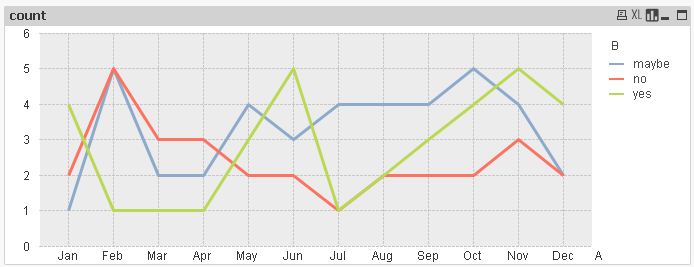
I need to make a line graph between dimension axis as A and Expression axis as number of counts of yes no or maybe individually.
I mean three line graphs (count (yes) vs A / count(no) vs A / and count(maybe) vs A) in same chart.
suggest any solution(s).
thanks in advance
- Tags:
- new_to_qlikview
Accepted Solutions

 MarcoWedel
- Mark as New
- Bookmark
- Subscribe
- Mute
- Subscribe to RSS Feed
- Permalink
- Report Inappropriate Content
Hi,
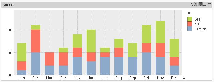
I agree that maybe a (stacked) bar chart is better suited for your data, e.g. you could see missing values of one category for one month:
hope this helps
regards
Marco
- Mark as New
- Bookmark
- Subscribe
- Mute
- Subscribe to RSS Feed
- Permalink
- Report Inappropriate Content
I think a barchart may be better suited for you.
Use the year as your dimension, then the count for the responses as your expressions
 rwunderlich
- Mark as New
- Bookmark
- Subscribe
- Mute
- Subscribe to RSS Feed
- Permalink
- Report Inappropriate Content
A as the first Dim.
B as the second DIm.
Expression: =count(B)
-Rob
MarcoWedel
- Mark as New
- Bookmark
- Subscribe
- Mute
- Subscribe to RSS Feed
- Permalink
- Report Inappropriate Content
Hi,
I agree that maybe a (stacked) bar chart is better suited for your data, e.g. you could see missing values of one category for one month:
hope this helps
regards
Marco
- Mark as New
- Bookmark
- Subscribe
- Mute
- Subscribe to RSS Feed
- Permalink
- Report Inappropriate Content
thank you Marco for detailed explanation. that was really helpful
thanks Rob and Robert