Unlock a world of possibilities! Login now and discover the exclusive benefits awaiting you.
- Qlik Community
- :
- Forums
- :
- Analytics & AI
- :
- Products & Topics
- :
- Reporting Service & Alerting
- :
- Percentages on labels of a stacked bar chart pixel...
- Subscribe to RSS Feed
- Mark Topic as New
- Mark Topic as Read
- Float this Topic for Current User
- Bookmark
- Subscribe
- Mute
- Printer Friendly Page
- Mark as New
- Bookmark
- Subscribe
- Mute
- Subscribe to RSS Feed
- Permalink
- Report Inappropriate Content
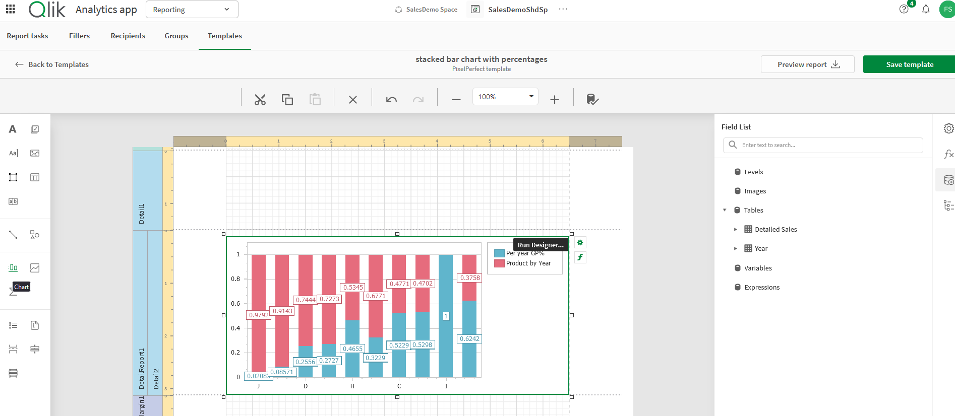
Percentages on labels of a stacked bar chart pixel perfect
Hi,
i'm tring to create a stacked bar chart in a pixel perfect template with percentages in labels using qlik sense cloud reporting.
I have not found anything for doing this.
Can anyone help me?
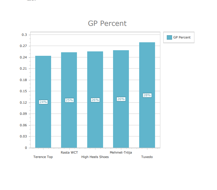
I have attached the screenshot of chart that i want to displaying percentages in labels...
Thanks,
Alessandro
Accepted Solutions
- Mark as New
- Bookmark
- Subscribe
- Mute
- Subscribe to RSS Feed
- Permalink
- Report Inappropriate Content
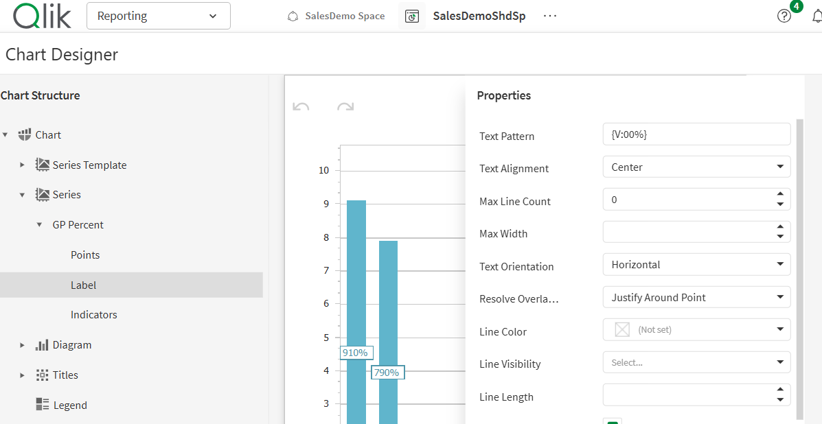
@zuk have you referenced this https://help.qlik.com/en-US/cloud-services/Subsystems/Hub/Content/Sense_Hub/Reporting/pixelperfect-t... ?
Screenshot of how I controlled the label attached
- Mark as New
- Bookmark
- Subscribe
- Mute
- Subscribe to RSS Feed
- Permalink
- Report Inappropriate Content
I'll get you started but it's pretty complex and I haven't fully completed this yet. You may get it done with the head start below.
- Choose and add the tables containing the data you wish to report (not levels in this case, just tables).
- Insert one detailed report band.
- Select and drag the chart object into your detailed report
- Then click run designer to start selecting your series bindings and switching to a stacked bar chart.
This old Nprinting Pixel Report designer article might help as well. Clearly there are many differences but some of it may apply to your requirement.
Kind regards...
- Mark as New
- Bookmark
- Subscribe
- Mute
- Subscribe to RSS Feed
- Permalink
- Report Inappropriate Content
Hi @Frank_S ,
Thanks for your response!
My requirement is that the value displayed in the label of the bars should not be 0.97 but 97%, for example.
Is there any way to do this?
Kind Regards,
Alessandro
- Mark as New
- Bookmark
- Subscribe
- Mute
- Subscribe to RSS Feed
- Permalink
- Report Inappropriate Content
@zuk have you referenced this https://help.qlik.com/en-US/cloud-services/Subsystems/Hub/Content/Sense_Hub/Reporting/pixelperfect-t... ?
Screenshot of how I controlled the label attached
- Mark as New
- Bookmark
- Subscribe
- Mute
- Subscribe to RSS Feed
- Permalink
- Report Inappropriate Content
Yes that's got it.
- Mark as New
- Bookmark
- Subscribe
- Mute
- Subscribe to RSS Feed
- Permalink
- Report Inappropriate Content
- Mark as New
- Bookmark
- Subscribe
- Mute
- Subscribe to RSS Feed
- Permalink
- Report Inappropriate Content
Hi @Andrew_Kruger & @Frank_S ,
Thank you very much for the immediate support!