Unlock a world of possibilities! Login now and discover the exclusive benefits awaiting you.
- Qlik Community
- :
- All Forums
- :
- Security & Governance
- :
- Why GetSelectedCount () changes the display ...?
- Subscribe to RSS Feed
- Mark Topic as New
- Mark Topic as Read
- Float this Topic for Current User
- Bookmark
- Subscribe
- Mute
- Printer Friendly Page
- Mark as New
- Bookmark
- Subscribe
- Mute
- Subscribe to RSS Feed
- Permalink
- Report Inappropriate Content
Why GetSelectedCount () changes the display ...?
Hi everyone,
I have a model on Qlick Sense that show the sales behavior of a specific category (Events), for a certain period of time. We currently have registers from sales for three years: 2015-2017.
The objective was to show, by default, the 2017 results, as long as there wasn´t any year selected on the "SalesYear" filter (AñoVenta in Spanish).
Tha´ts why I decided to use the function GetSelectedCount() that returns the number of selections active on a filter. If this number is cero then there are no active selections, which then should trigger the default behavior of showing just 2017.
The expression I used was:
if (GetSelectedCount([AñoVenta])= 0,
(Sum({1<[Categoría_Ingreso]={"Eventos"}>
*1<[AñoVenta]={"2017"}>
}ValorBaseFacturado)/1000000),
(Sum({$<[Categoría_Ingreso]={"Eventos"}>}
ValorBaseFacturado)/1000000))
On the chart, however, all years are show in the dimension axis, with only the months of 2017 showing any values. The others are shown with values of 0:
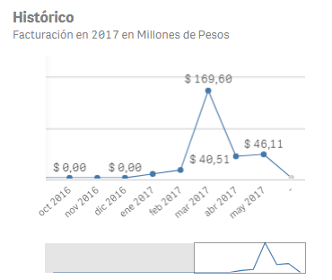
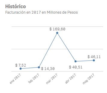
In contrast, this is the original expression:
Sum({$<[Categoría_Ingreso]={"Eventos"}>
*1<[AñoVenta]={"2017"}>}
ValorBaseFacturado)/1000000
That shows this chart, which is the one I want:
I would like to know why including that "if" changes the chart so much, and if there is a way to avoid that...
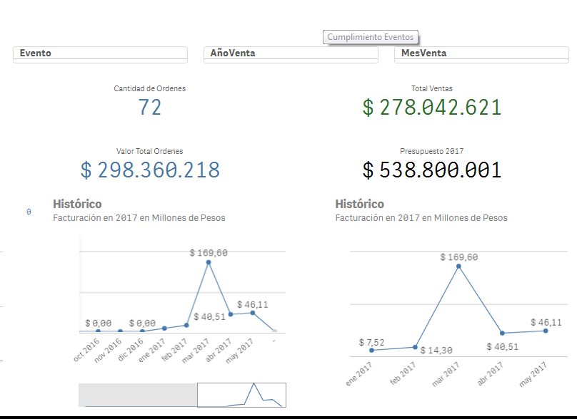
This is how the screen looks with the filters:
Thanks a lot for any help you guys can provide...
- Mark as New
- Bookmark
- Subscribe
- Mute
- Subscribe to RSS Feed
- Permalink
- Report Inappropriate Content
Have you unchecked 'Include Zero Values' under Data handling?