Unlock a world of possibilities! Login now and discover the exclusive benefits awaiting you.

- Qlik Community
- :
- Forums
- :
- Analytics & AI
- :
- Products & Topics
- :
- Visualization and Usability
- :
- Aging chart
- Subscribe to RSS Feed
- Mark Topic as New
- Mark Topic as Read
- Float this Topic for Current User
- Bookmark
- Subscribe
- Mute
- Printer Friendly Page

 dnt503
- Mark as New
- Bookmark
- Subscribe
- Mute
- Subscribe to RSS Feed
- Permalink
- Report Inappropriate Content
Aging chart
Hello, I need help with creating an expression for the chart below. Thank you in advance


.png "Former Employee") JonnyPoole
JonnyPoole
- Mark as New
- Bookmark
- Subscribe
- Mute
- Subscribe to RSS Feed
- Permalink
- Report Inappropriate Content
Please share the sample data that you would be using to produce such a chart. With some sample data community members can provide some logical approaches.
dnt503
- Mark as New
- Bookmark
- Subscribe
- Mute
- Subscribe to RSS Feed
- Permalink
- Report Inappropriate Content
Hi, here's the sample data in Excel. I want to only look at Case ID that are currently open and portray in a chart similar to the one above. Thank you.
JonnyPoole
- Mark as New
- Bookmark
- Subscribe
- Mute
- Subscribe to RSS Feed
- Permalink
- Report Inappropriate Content
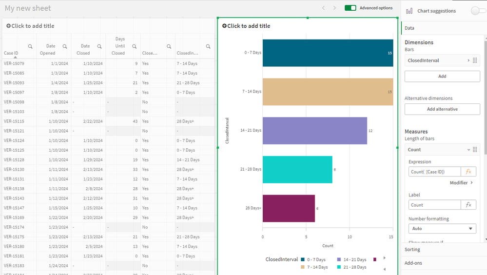
The class() function is helpful to create buckets of the data. The exception is the 28+ bucket which is open ended so I had to use if() statements to account for that.
I also used date subtraction to calculate the interval. If you floor dates they can be represented as integers which helps do a simple subtraction to get a day interval.
I also used a preceding load to feed calculations from the first load into the class() expression
Here is the script:
JonnyPoole
- Mark as New
- Bookmark
- Subscribe
- Mute
- Subscribe to RSS Feed
- Permalink
- Report Inappropriate Content
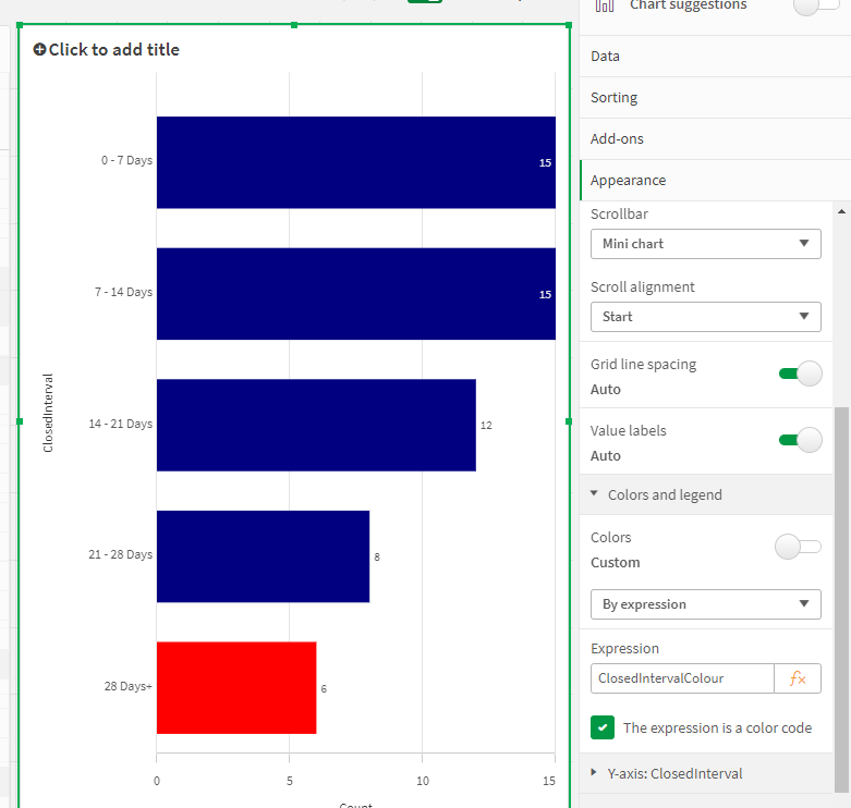
Forgot the colour. You can do colours in the UI properties, but since I already did the expression in the script, I just copied/pasted and put the color expression in the script too

 pravinboniface
- Mark as New
- Bookmark
- Subscribe
- Mute
- Subscribe to RSS Feed
- Permalink
- Report Inappropriate Content
@dnt503 Can you try the following:
// Load some sample representative data
data:
Load * inline [
Case ID,Date Opened,Date Closed
VER-15085,01/03/2024,01/10/2024
VER-15079,01/01/2024,01/10/2024
VER-15428,02/28/2024,03/05/2024
VER-15192,01/24/2024,-
VER-15121,01/10/2024,-
];
left Join
Load
	if (today()-[Date Opened]<= 7, '0-7 days',
    	if (today()-[Date Opened]<= 14, '8-14 days',
        	if (today()-[Date Opened]<= 21, '15-21 days',
            	if (today()-[Date Opened]<= 28, '22-28 days',
                								'28+ days')))) as aging
resident data;
exit Script;
In colors and legend, use custom colors by expression
if (aging='28+ days',red(),blue())
