Unlock a world of possibilities! Login now and discover the exclusive benefits awaiting you.
- Qlik Community
- :
- Forums
- :
- Analytics & AI
- :
- Products & Topics
- :
- Visualization and Usability
- :
- Alter chart range max and min values based on meas...
- Subscribe to RSS Feed
- Mark Topic as New
- Mark Topic as Read
- Float this Topic for Current User
- Bookmark
- Subscribe
- Mute
- Printer Friendly Page
- Mark as New
- Bookmark
- Subscribe
- Mute
- Subscribe to RSS Feed
- Permalink
- Report Inappropriate Content
Alter chart range max and min values based on measure selected
Greetings,
I have a chart which functions aok except when the measure is changed from it's default.
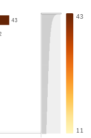
It renders as follows with Measure 1 selected: (note the bar on the left hand side is the max value of the set)

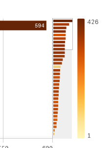
When Measure 2 is selected it shows as follows:

How do I set the custom range values based on the selected measure?
- Mark as New
- Bookmark
- Subscribe
- Mute
- Subscribe to RSS Feed
- Permalink
- Report Inappropriate Content
Appearance > Colors and legend > Color > Range
Set the Range from auto to Custom, enter values or expressions that calculate values in the fields Min and Max.
Qlik Community MVP
- Mark as New
- Bookmark
- Subscribe
- Mute
- Subscribe to RSS Feed
- Permalink
- Report Inappropriate Content
Thanks Vegar,
Yes, I have fund the inputs, but cannot get a handle to the selected measure.
Sorry, should have been clearer.
Expressions are my Achilles heal for the moment. Suggestions welcomed.
- Mark as New
- Bookmark
- Subscribe
- Mute
- Subscribe to RSS Feed
- Permalink
- Report Inappropriate Content
Should the scale be fixed over all selections or should it re-calibrate on
certain conditions?
Could you post your chart expression and which dimension field names you
are using in your chart?
Qlik Community MVP
- Mark as New
- Bookmark
- Subscribe
- Mute
- Subscribe to RSS Feed
- Permalink
- Report Inappropriate Content
... sure.
I have dimension one, which displays a count of widgets.
The bar chart is displayed by customer with each customer's widgets displayed and ordered in descending order by Count(distinct "widgets").
The bar chart has three dimensions, which correctly display the max and min values on the right hand side range legend scale as shown in the images provided. The maximum number of type one widgets per customer is 43.
The other dimension are Widget Location and Widget Supplier.
When the dimension is changed to Widget Location and the Measure remains as Count(distinct "widgets") the range legend indicator shows the correct number of widgets, which in this case is 426, so both the maximum value the bar chart displays is the total 426, which agrees with the range indicator on the right hand side.
There are two measures. Count(distinct "widgets") and Count(distinct "CustomerID").
When the measure is changed to Count(distinct "CustomerID") and, as in the case shown in the images above, the dimension selected is "Widget Location", the bar chart maximum value displayed is 594, which is correct, but the range legend indicator continue to display the maximum and minimum values of the measure Count(distinct "widgets").
The expression I currently have in the charts Properties | Appearance | Colors and Legend | Select Measure is:
=Count(distinct "widgets"). - I shall refer to this as the "Select Measure."
The Range is currently set "Auto." - I shall refer to this as the "Measure Range."
I believe I should be setting the values in the "Measure Range", but I cannot find a function to identify the selection of the measure for use in an If statement so I can set the range using the "Custom" option.
Also I believe that the "Select Measure" needs to be dynamic.
Thanks in anticipation.
Cheers
- Mark as New
- Bookmark
- Subscribe
- Mute
- Subscribe to RSS Feed
- Permalink
- Report Inappropriate Content
It sounds kind of odd that the Qlik Sense objects does not recognize which measure is active to recalibrate the legend colors. I've hard to see this behavior as a desired feature, it sounds like a bug or a good feature request.
As you can't really fetch which measure that is active in your expression you will need to do some kind of work around. I've two approaches that you could try out.
1. Assign the second measure to the secondary axis.
2. Use one measure for the two expression and keep the logic to switch between them in the application using an field data island or variables. You can switch between color calculations with the same approach. I did an example of this approach for switching between KPIs in another thread last week. https://community.qlik.com/t5/New-to-Qlik-Sense/YTD-as-KPI/m-p/1578241/highlight/true#M135069
Qlik Community MVP
