Unlock a world of possibilities! Login now and discover the exclusive benefits awaiting you.
Announcements
Now accepting applications for the Qlik Luminary and Partner Ambassador Programs: Apply by July 6!
- Qlik Community
- :
- Forums
- :
- Analytics & AI
- :
- Products & Topics
- :
- Visualization and Usability
- :
- Bar Chart - Qliksense
Options
- Subscribe to RSS Feed
- Mark Topic as New
- Mark Topic as Read
- Float this Topic for Current User
- Bookmark
- Subscribe
- Mute
- Printer Friendly Page
Turn on suggestions
Auto-suggest helps you quickly narrow down your search results by suggesting possible matches as you type.
Showing results for
Contributor III
2018-05-28
06:56 AM
- Mark as New
- Bookmark
- Subscribe
- Mute
- Subscribe to RSS Feed
- Permalink
- Report Inappropriate Content
Bar Chart - Qliksense
Hi Experts,
Need your Guidance...
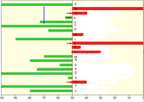
I want to achieve a bar chart as below in Qliksense. Chart should display a Value from (0-100) for each Dimension Values.
Value lesser than 50 should be highlighted in Red and Value greater than equal to 50 should highlighted in Green. Chart Should show Benchmark (Blue vertical line) for few dimension values.
Is this achievable in Qlik Sense?
Attached is the sample data. Thanks in Advance!
929 Views
1 Reply
MVP
2018-05-28
09:05 AM
- Mark as New
- Bookmark
- Subscribe
- Mute
- Subscribe to RSS Feed
- Permalink
- Report Inappropriate Content
May be look here