Unlock a world of possibilities! Login now and discover the exclusive benefits awaiting you.
- Qlik Community
- :
- Forums
- :
- Analytics & AI
- :
- Products & Topics
- :
- Visualization and Usability
- :
- Color coding a bar chart with aggregated measures
- Subscribe to RSS Feed
- Mark Topic as New
- Mark Topic as Read
- Float this Topic for Current User
- Bookmark
- Subscribe
- Mute
- Printer Friendly Page
- Mark as New
- Bookmark
- Subscribe
- Mute
- Subscribe to RSS Feed
- Permalink
- Report Inappropriate Content
Color coding a bar chart with aggregated measures
Dear all,
i want to color code my bar chart in a way that will make it look similar to a boxplot.
May data (very simplified) looks like this:
Load * Inline [
G, Attribute,Key, Value,
1,a,'01',10
1,b,'01',4
2,a,'01',7
2,b,'01',11]
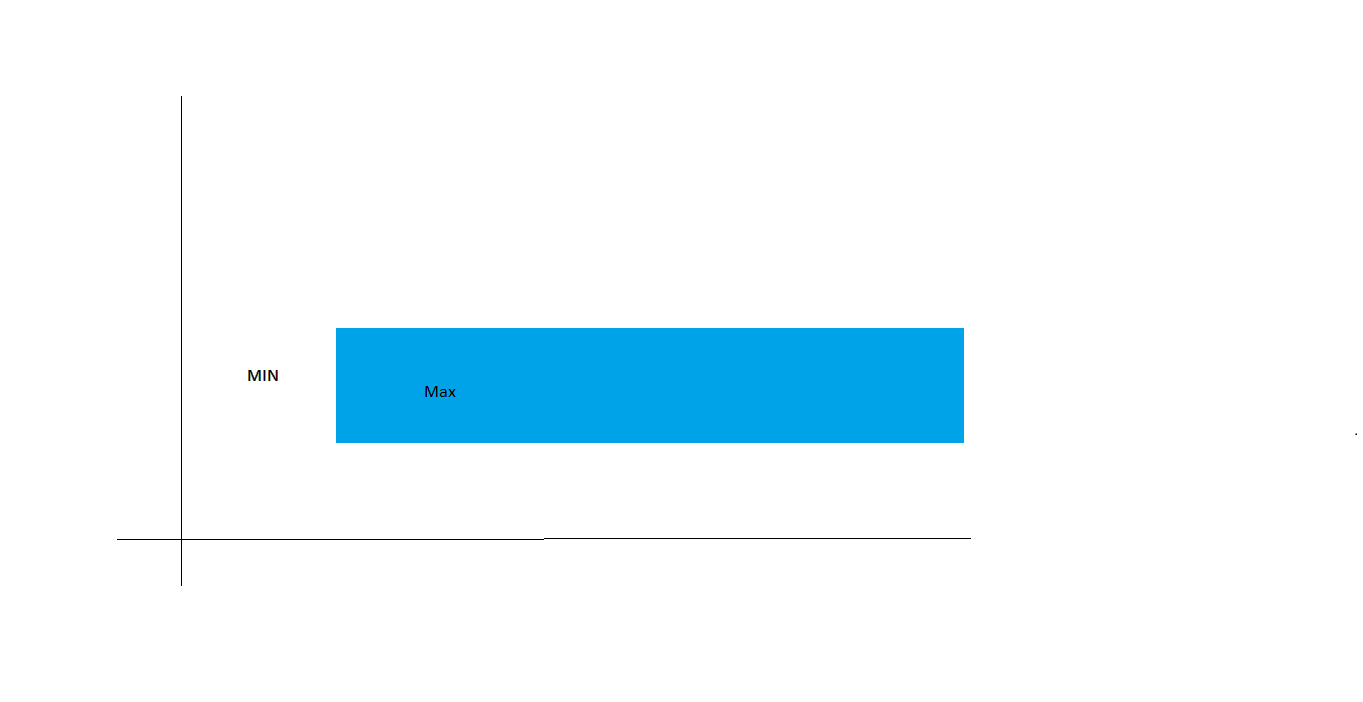
There are two bars, one for the min and one for the max value, which will be stacked on top of each other. I want to color the min value white and the max value blue (so that it looks like the picture).
The min and max (e.g. max-min) are calculated from an aggregation:
min(aggr(sum({state1 <key={'01'}>}value),G,key))
max(aggr(sum({state1 <key={'01'}>}value),G,key))
So min should be 14 and max 18.
I already found this link to 'fake' a dimension: https://community.qlik.com/t5/Documents/Qlik-Sense-How-to-set-custom-colors-by-measure-in-a-bar-char...
Without the aggregation this works perfectly fine. But if i put an aggregation in the if statement only the first gets calculated.
Does anybody know how else i could color code the bar chart. The only thing i defintely can't do is make another table in the load statement with the aggregated values, because i still need to be able to filter the attributes.
Thank you very much in advance!!
Accepted Solutions
- Mark as New
- Bookmark
- Subscribe
- Mute
- Subscribe to RSS Feed
- Permalink
- Report Inappropriate Content
Create your measures as Master Elements and color them :

Now, create a bar chart, with a dimension like "valueliste('min max')
and use your 2 master measures , result :

- Mark as New
- Bookmark
- Subscribe
- Mute
- Subscribe to RSS Feed
- Permalink
- Report Inappropriate Content
Create your measures as Master Elements and color them :
Now, create a bar chart, with a dimension like "valueliste('min max')
and use your 2 master measures , result :
- Mark as New
- Bookmark
- Subscribe
- Mute
- Subscribe to RSS Feed
- Permalink
- Report Inappropriate Content
Hey,
i looks a little bit different in my qlik sense. But i tried to do that.

and

But the bar chart doesn't use the segment color...

Do you know why?
- Mark as New
- Bookmark
- Subscribe
- Mute
- Subscribe to RSS Feed
- Permalink
- Report Inappropriate Content
Hey,
i just updated to the February 2021 release and now it looks the same and also works for me!
Thank you very much!!!