Unlock a world of possibilities! Login now and discover the exclusive benefits awaiting you.

- Qlik Community
- :
- Forums
- :
- Analytics & AI
- :
- Products & Topics
- :
- Visualization and Usability
- :
- Color the bar chart with specific colors
- Subscribe to RSS Feed
- Mark Topic as New
- Mark Topic as Read
- Float this Topic for Current User
- Bookmark
- Subscribe
- Mute
- Printer Friendly Page

- Mark as New
- Bookmark
- Subscribe
- Mute
- Subscribe to RSS Feed
- Permalink
- Report Inappropriate Content
Color the bar chart with specific colors
Good Morning!
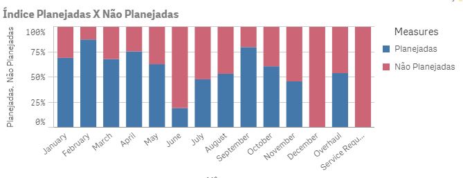
I have a chart with two references, "Planned," "Unplanned." I would like the reference "Planned" to be Green in the chart and the reference "Not Planned" would be red.
Planejadas:
Count({<[TipodeManutenção] = {'Preventiva Baseada no Tempo'}>}[TipodeManutenção])/Count({<[TipodeManutenção] = {'Preventiva Baseada no Tempo','Preventiva Baseada na Condição','Corretiva'}>}[TipodeManutenção])
Não Planejadas
Count({<[TipodeManutenção] = {'Preventiva Baseada na Condição','Corretiva'}>}[TipodeManutenção])/Count({<[TipodeManutenção] = {'Preventiva Baseada no Tempo','Preventiva Baseada na Condição','Corretiva'}>}[TipodeManutenção])

 rittermd
- Mark as New
- Bookmark
- Subscribe
- Mute
- Subscribe to RSS Feed
- Permalink
- Report Inappropriate Content
It is a little complicated. But can be done. You would need to modify these with your values.
You need to add a 2nd Dimension using ValueList function like
ValueList('Admit','DC','Gain')
Then modify your measure like this:
if(ValueList('Admit','DC','Gain')='Admit'
,Avg(MeasureValueStart)
,if(ValueList('Admit','DC','Gain')='DC'
,Avg(MeasureValueEnd)
,Avg(Gain)
)
)
Then under Appearance/Colors you need to do by Expression and use something like this:
if(ValueList('Admit','DC','Gain')='Gain'
,rgb(0,255,0)
,if(ValueList('Admit','DC','Gain')='Admit'
,rgb(0,0,192)
,rgb(192,0,0)
)
)