Unlock a world of possibilities! Login now and discover the exclusive benefits awaiting you.
- Qlik Community
- :
- Forums
- :
- Analytics & AI
- :
- Products & Topics
- :
- Visualization and Usability
- :
- Colored rectangle on the tooltip (QlikSense)
- Subscribe to RSS Feed
- Mark Topic as New
- Mark Topic as Read
- Float this Topic for Current User
- Bookmark
- Subscribe
- Mute
- Printer Friendly Page
- Mark as New
- Bookmark
- Subscribe
- Mute
- Subscribe to RSS Feed
- Permalink
- Report Inappropriate Content
Colored rectangle on the tooltip (QlikSense)
Dear all,
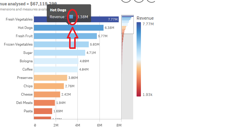
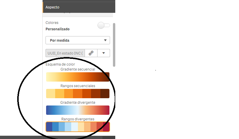
My client loves the colored rectangles on the tooltip (please find attached an image in order to visualise it // Tootip - Colored Rectangle.png) of a bar chart when coloring it by measure. Unfortunately, he does not like the default colors of Sequential Gradient, Sequential Ranges, Divergent Gradient and Divergent Ranges (attached image // Colors.png).
1. Is it posible to change the default colors (by measure)?
2. I am able to achieve a similar effect if I decide to color the chart by expression. Unfortunately, in this case, it does not display the colored rectangles on the tootip. Is it possible to force this effect?
Thank you very much in advance. I would really appreciate any help/tip.
Best regards,
Gonzalo
- Mark as New
- Bookmark
- Subscribe
- Mute
- Subscribe to RSS Feed
- Permalink
- Report Inappropriate Content
how do u want to change it?
any idea in mind?