Unlock a world of possibilities! Login now and discover the exclusive benefits awaiting you.
- Qlik Community
- :
- Forums
- :
- Analytics & AI
- :
- Products & Topics
- :
- Visualization and Usability
- :
- Re: Create Line Chart that Compares Selections Ins...
- Subscribe to RSS Feed
- Mark Topic as New
- Mark Topic as Read
- Float this Topic for Current User
- Bookmark
- Subscribe
- Mute
- Printer Friendly Page
- Mark as New
- Bookmark
- Subscribe
- Mute
- Subscribe to RSS Feed
- Permalink
- Report Inappropriate Content
Create Line Chart that Compares Selections Instead of Grouping Them
New to Qlik Sense, thanks for your patience.
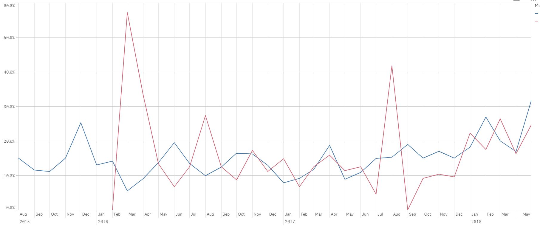
I've created a line chart (see attached jpeg. I couldn't insert photo here, I got an error saying file type was forbidden for jpeg, png etc)
Fields: Result, Machine
The blue line is based on a measure I created with set analysis to show the percent of {Bad} results in the [Result] field.
- Expression: count({$<[Result]={Bad}>} [Result]) / ((count({$<[Result]={[Good]}>} [Result]) + count({$<[Result]={[Bad]}>} [Result]))
- Possible results in field [Result] are {Good, Bad}
- This line changes based on selections in filter panes etc, as it should
The red line is based on a measure I created with set analysis to show the percent of [Bad] results in the [Result] field made by machine {12} only.
- Expression: count({$<[Result]={Bad}, [Machine]={12}>} [Result]) / ((count({$<[Result]={[Good]}>} [Result]) + count({$<[Result]={[Bad]}, [Machine]={12}>} [Result])))
- Possible results in field [Machine] are hundreds! And that's where my problem and question begins...
- This line doesn't change but only appears when machine 12 forms part of larger selection, as it should
In theory, I could create a measure for every single machine (painful and not practical!), but I'm sure there has to be a better approach. Thoughts?
Ideally, I'd like a line chart that shows multiple lines, one for each machine that corresponds to their individual percentages so I can compare them to each other.
Ideally, I could select which machines to display individual lines for by selecting them from a filterpane/listbox. But, given qlik's associative selection process, selecting multiple machines just groups them together instead of selecting them for individual lines.
Thanks in advance for your help.
Accepted Solutions
- Mark as New
- Bookmark
- Subscribe
- Mute
- Subscribe to RSS Feed
- Permalink
- Report Inappropriate Content
Agree with Andy - and I attached a sample app which also adds a total for all machines so you can have as a month-to-month reference...

- Mark as New
- Bookmark
- Subscribe
- Mute
- Subscribe to RSS Feed
- Permalink
- Report Inappropriate Content
Add machine as a dimension to get each machine its own line in your chart without hard coding.
Add your machine 12 as a reference line in add ons.
- Mark as New
- Bookmark
- Subscribe
- Mute
- Subscribe to RSS Feed
- Permalink
- Report Inappropriate Content
Agree with Andy - and I attached a sample app which also adds a total for all machines so you can have as a month-to-month reference...
- Mark as New
- Bookmark
- Subscribe
- Mute
- Subscribe to RSS Feed
- Permalink
- Report Inappropriate Content
Wow, thank you for you quick response, Andy.
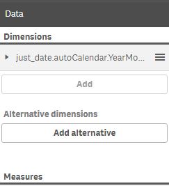
I was wondering if adding multiple dimensions was possible, because I still need time on the x axis as well.
In the data section, it seems like I can only have one dimension, the add button is grayed out. I can only add alternative dimensions, which is not the desired result to show all lines together.
- Mark as New
- Bookmark
- Subscribe
- Mute
- Subscribe to RSS Feed
- Permalink
- Report Inappropriate Content
Petter -- thank you for your timely response. This chart looks amazing and EXACTLY what I think I need.
Please see response to Andy - I can't seem to add more than one dimension. I need time and machine. It looks like it only allows me to add alternatives.
Separately, I would love to open the sample qvf file you attached but I can never open these. The link just prompts me to look up online where/how to open that file type and I get stuck there. Any guidance on how I can open that sample app?
Thanks again
- Mark as New
- Bookmark
- Subscribe
- Mute
- Subscribe to RSS Feed
- Permalink
- Report Inappropriate Content
After you have downloaded the app you can move the .qvf file into this folder:
Documents\Qlik\Sense\Apps
Where Documents is you Documents folder....
For me it would look like:
C:\Users\pts\Documents\Qlik\Sense\Apps
but you have to replace pts with your username....
- Mark as New
- Bookmark
- Subscribe
- Mute
- Subscribe to RSS Feed
- Permalink
- Report Inappropriate Content
Petter -- thank you for all your help. I got it!
Replying to my own message in case this helps someone else. Solution seems strange, but it worked.
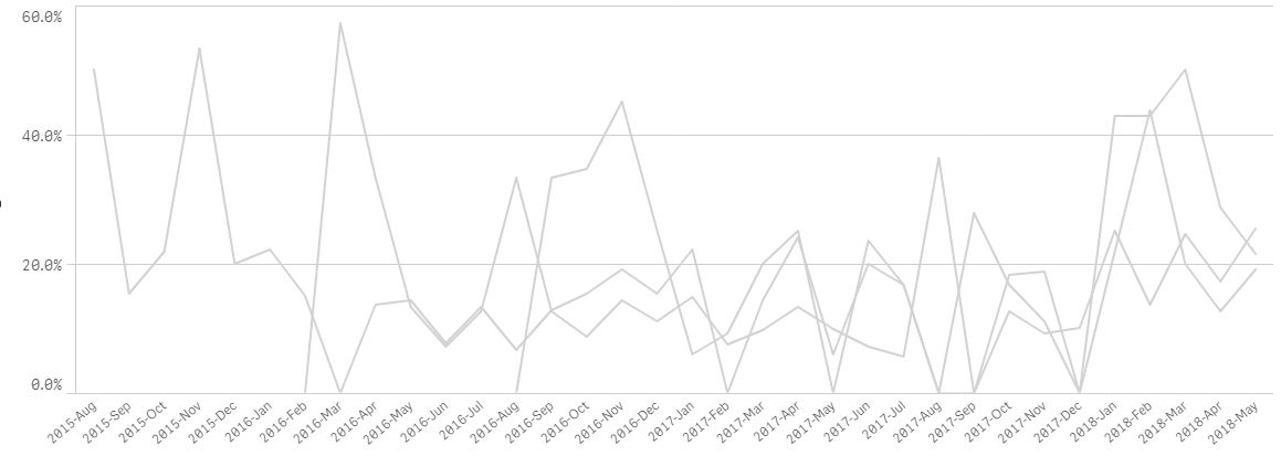
Initially, I couldn't add an additional dimension to my chart as mentioned above. I copied Petter's chart from his app into my app and then I was able to edit the second dimension. However, when I updated the fields with my apps' field names the lines turned gray and no field names were listed in the chart legend. See grab:
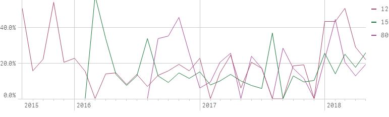
So, I tried to create a line graph from scratch, and then I was able to add more than one dimension even though I was restricted before. I thought that was strange. In the end, it worked, which is what matters. I added the time dimension and the machine dimension and the percentage measure and that was it. See grab:
Thank you all for your time.
Additional note for anyone else regarding opening qvf files. I imagine Petter's instructions work great for the desktop version. I am using the enterprise server version which required me to import his app. However, I couldn't personally do that, I had to request an admin developer to do so, j FYI. Once the admin imported it, I could access.
More on importing:
https://help.qlik.com/en-US/sense/June2018/Subsystems/ManagementConsole/Content/import-apps.htm