Unlock a world of possibilities! Login now and discover the exclusive benefits awaiting you.
Announcements
Now accepting applications for the Qlik Luminary and Partner Ambassador Programs: Apply by July 6!
- Qlik Community
- :
- Forums
- :
- Analytics & AI
- :
- Products & Topics
- :
- Visualization and Usability
- :
- Create a pie chart with different column values
Options
- Subscribe to RSS Feed
- Mark Topic as New
- Mark Topic as Read
- Float this Topic for Current User
- Bookmark
- Subscribe
- Mute
- Printer Friendly Page
Turn on suggestions
Auto-suggest helps you quickly narrow down your search results by suggesting possible matches as you type.
Showing results for
Anonymous
Not applicable
2018-10-25
04:01 AM
- Mark as New
- Bookmark
- Subscribe
- Mute
- Subscribe to RSS Feed
- Permalink
- Report Inappropriate Content
Create a pie chart with different column values
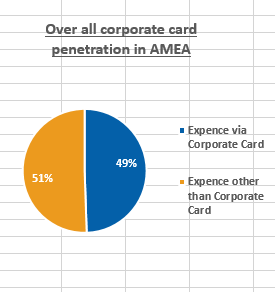
I have to create a pie chart with values present in 2 different columns of a straight table. As I have multi dimension data and I am using it for several other analysis, hence I don't want to change the data structure. Below is the data table -
| ReportingMonth | Country | Region | Division | Local Currency | CardExpenseUSD | CashExpenseUSD | TotalExpenseUSD |
| Apr | Argentina | LaCan | A | ARS | 89807.64 | 61740.41 | 151548.05 |
| Apr | Austria | Europe | A | EUR | 0 | 15199.28 | 15199.28 |
| Apr | Austria | Europe | B | EUR | 0 | 40415.22 | 40415.22 |
| Apr | Belgium | Europe | A | EUR | 5074.69 | 24482.58 | 29557.27 |
| Apr | Belgium | Europe | B | EUR | 294.19 | 5916.74 | 6210.93 |
| Apr | Brazil | LaCan | A | BRL | 90475.26 | 18940.26 | 109415.52 |
| Apr | Brazil | LaCan | B | BRL | 13498.86 | 6110.26 | 19609.12 |
| Apr | Canada | LaCan | A | CAD | 386031.03 | 32068.78 | 418099.81 |
| Apr | Canada | LaCan | B | CAD | 76487.12 | 5577.3 | 82064.42 |
I want a pie chart for Europe Region, showing the ration between 'Expense via Corporate Card' (CardExpenseUSD) : 'Expense other than Corporate Card' (CashExpenseUSD).
551 Views
0 Replies