Unlock a world of possibilities! Login now and discover the exclusive benefits awaiting you.
- Qlik Community
- :
- Forums
- :
- Analytics & AI
- :
- Products & Topics
- :
- Visualization and Usability
- :
- Cummulative Revenue in graph
- Subscribe to RSS Feed
- Mark Topic as New
- Mark Topic as Read
- Float this Topic for Current User
- Bookmark
- Subscribe
- Mute
- Printer Friendly Page
- Mark as New
- Bookmark
- Subscribe
- Mute
- Subscribe to RSS Feed
- Permalink
- Report Inappropriate Content
Cummulative Revenue in graph
Hi All,
I'm really, really new to Qlik so please excuse me if I'm asking stupid stuff 😀
I have sales data and I like to build a graph that show on the x-axis the date and on the y-axis the cummulative sales achieved until that date.
My data looks like this
- date: 01/01/yyyy sales: € 0
- date: 02/01/yyyy sales: € 100
- date: 03/01/yyyy sales: € 125
- date: 04/01/yyyy sales: € 75 etc....
I want my graph to show the cummulative achieved result:
- date: 01/01/yyyy sales: € 0
- date: 02/01/yyyy sales: € 100
- date: 03/01/yyyy sales: € 225
- date: 04/01/yyyy sales: € 300 etc.....
Currently my graph shows total sales per day with Fx for Measures being: Sum(Order_Mgmt_Net_CLC)
Can you please give me tip's on how to build a formula that calculates cummulative value for each date?
Thank you
Regards, Charles
- Mark as New
- Bookmark
- Subscribe
- Mute
- Subscribe to RSS Feed
- Permalink
- Report Inappropriate Content
You can check this out: RangeSum and look for the "Example with expression:" section
- Mark as New
- Bookmark
- Subscribe
- Mute
- Subscribe to RSS Feed
- Permalink
- Report Inappropriate Content
Hi Charlesvan,
To add up to Sunny's reply:
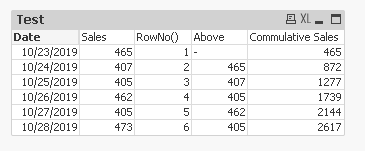
You should use a combination between RangeSum() and Above() functions, providing the RowNo() as parameter to the Above.
The expression you want to build should look something like this:
=RangeSum(Above(Sum([Sales]),1,RowNo()))+Sum([Sales])
You'd also want to use the Date as a dimension.
Expected result should look like the pic below. I've separated each of the logical components in a separate measure for better assimilation:
I hope that helps!
Kind regards,
S.T.
