Unlock a world of possibilities! Login now and discover the exclusive benefits awaiting you.
Announcements
Now accepting applications for the Qlik Luminary and Partner Ambassador Programs: Apply by July 6!
- Qlik Community
- :
- Forums
- :
- Analytics & AI
- :
- Products & Topics
- :
- Visualization and Usability
- :
- Formating the Y-axis
Options
- Subscribe to RSS Feed
- Mark Topic as New
- Mark Topic as Read
- Float this Topic for Current User
- Bookmark
- Subscribe
- Mute
- Printer Friendly Page
Turn on suggestions
Auto-suggest helps you quickly narrow down your search results by suggesting possible matches as you type.
Showing results for
Anonymous
Not applicable
2017-04-20
02:46 PM
- Mark as New
- Bookmark
- Subscribe
- Mute
- Subscribe to RSS Feed
- Permalink
- Report Inappropriate Content
Formating the Y-axis
Hi All,
I have a chart that shows data for APAC region.
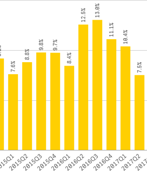
When I add additional dimension to it I get the below chart. I would like to restrict the Y-axis. For eg: in 2017Q1 - it was 10.4% in the below chart it shows 86.1% which isn't true.I need to show the 10.4% same but with values of regions within APAC.

407 Views
1 Reply
Partner - Champion II
2017-04-20
05:57 PM
- Mark as New
- Bookmark
- Subscribe
- Mute
- Subscribe to RSS Feed
- Permalink
- Report Inappropriate Content
can you share a sample app with thes 2 graphs? to a look at your expressions and diretly test on it to be more efficient?
360 Views