Unlock a world of possibilities! Login now and discover the exclusive benefits awaiting you.
- Qlik Community
- :
- Forums
- :
- Analytics & AI
- :
- Products & Topics
- :
- Visualization and Usability
- :
- Formatting Scatter Plots
- Subscribe to RSS Feed
- Mark Topic as New
- Mark Topic as Read
- Float this Topic for Current User
- Bookmark
- Subscribe
- Mute
- Printer Friendly Page
- Mark as New
- Bookmark
- Subscribe
- Mute
- Subscribe to RSS Feed
- Permalink
- Report Inappropriate Content
Formatting Scatter Plots
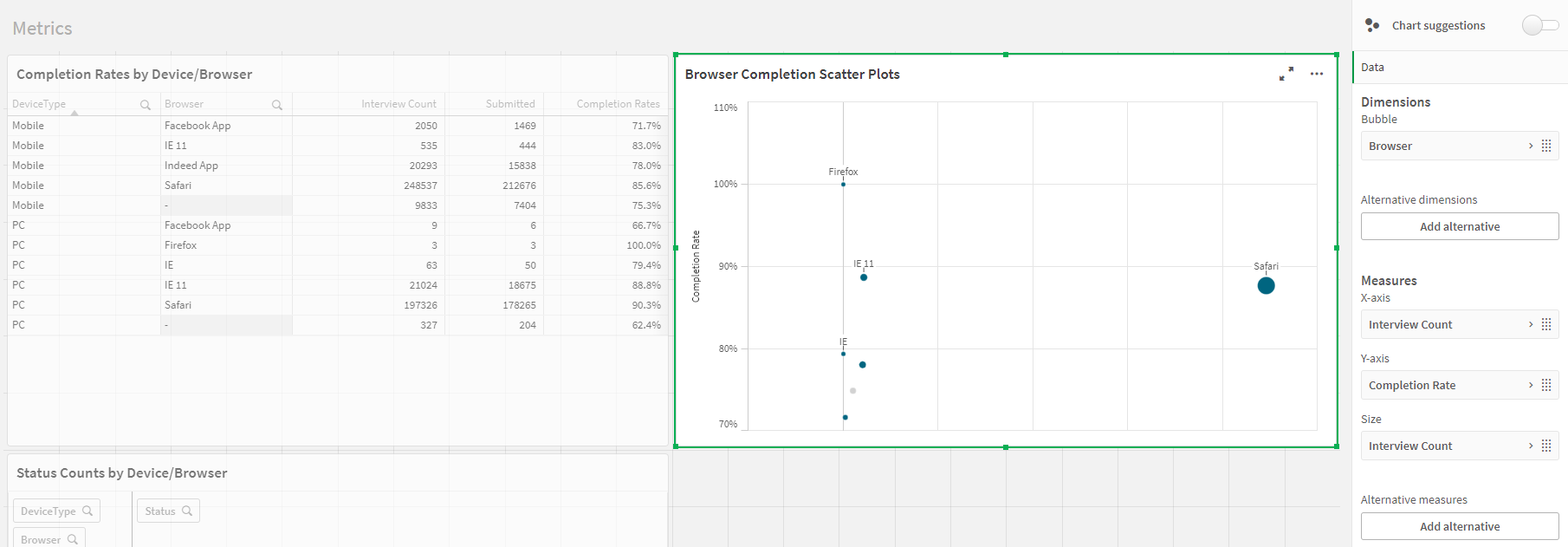
I am attempting to format a interview count scatter graph that derives from 4 different dimensions/metrics. The 1st being the Device Type (Mobile or PC), The browser being used, the count of how many people were invited (Interview Count), and the completion rates of the interviews.
What I am trying to achieve is attached. I have almost succeeded, however I am currently trying to see if there is a way that I can split the current dots into two separate categories. I am currently getting the completion rate to interview count/size, broken down by browser (I hid the X axis that displays interview count as I chose to leverage interview count for the size), however I want to take the current blue plots and break them into two colors, with the PC results being one color and the Mobile results being the other (To look like the other attached scatter plot).
Any guidance on how to make the Qlik scatter plot look like the attached Excel scatter plot? (And potentially a way to fix how the larger bubbles are pushed far right opposed to clumped like the other plot? Seems I needed to provide an X access no matter what).
Thanks!