Unlock a world of possibilities! Login now and discover the exclusive benefits awaiting you.

- Qlik Community
- :
- Forums
- :
- Analytics & AI
- :
- Products & Topics
- :
- Visualization and Usability
- :
- Re: Get Name category which is the max represented
- Subscribe to RSS Feed
- Mark Topic as New
- Mark Topic as Read
- Float this Topic for Current User
- Bookmark
- Subscribe
- Mute
- Printer Friendly Page

 rpages
- Mark as New
- Bookmark
- Subscribe
- Mute
- Subscribe to RSS Feed
- Permalink
- Report Inappropriate Content
Get Name category which is the max represented
Hi all,
I 've this kind of data
| Office | Category | name | id |
| NYC | A | Alice | 1 |
| NYC | A | Alice | 2 |
| NYC | B | Alice | 3 |
| NYC | C | Bob | 4 |
| NYC | A | Alice | 5 |
| NYC | B | Bob | 6 |
| NYC | C | Bob | 7 |
| Chicago | C | Christopher | 8 |
I need to make a bar chart where Alice has 75% of cat A and 25% of cat B , bob is 66% cat C et 33% cat B and Christopher is 100% cat C.
And then in an other graph, I need to show that NYC as 50% of cat A and 50 of cat C and Chicago is 100% cat C.
Does anyone has a solution?
Thank you very much

 rogerpegler
- Mark as New
- Bookmark
- Subscribe
- Mute
- Subscribe to RSS Feed
- Permalink
- Report Inappropriate Content
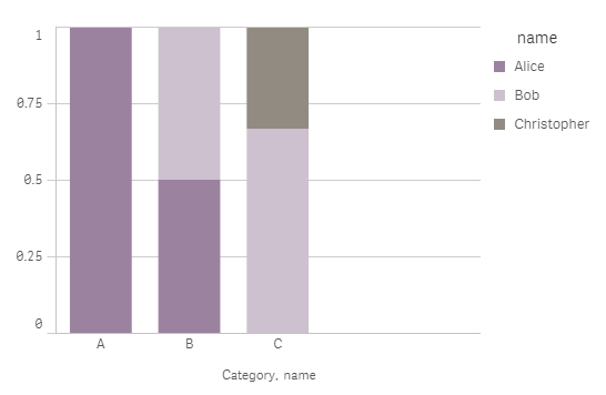
In your bar chart have Category and name as dimensions in that order. The measure would be:
sum(aggr(count(Category),name,Category))/count(TOTAL<Category> Category)
Select stacked under Appearance.

 sunny_talwar
- Mark as New
- Bookmark
- Subscribe
- Mute
- Subscribe to RSS Feed
- Permalink
- Report Inappropriate Content
For 1st one, may be this
Dimension
Office
Category
Expression
Count(id)/Count(TOTAL <Category> id)
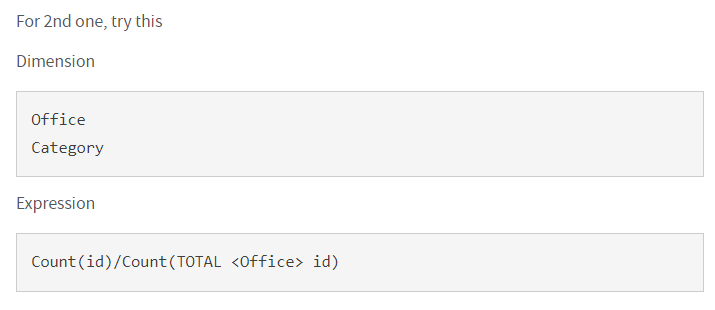
For 2nd one, try this
Dimension
Office
Category
Expression
Count(id)/Count(TOTAL <Office> id)
rpages
- Mark as New
- Bookmark
- Subscribe
- Mute
- Subscribe to RSS Feed
- Permalink
- Report Inappropriate Content
Thank you both.
Your 2 examples help me very much.
My final formula is
count( id)/count( TOTAL <region,office> id) and I use category as a dimension.
But now I have a new problem : I cannot count the number of people by office which work on a category as max.
I have the repartition of activity by office, by region and by person, but I would like to count the number of people by office which work max in A, max in B, ... and display it to say :Office 1 : 3 people do A at most, 2 people do B,...
Have you an idea?
Thank you very much
sunny_talwar
- Mark as New
- Bookmark
- Subscribe
- Mute
- Subscribe to RSS Feed
- Permalink
- Report Inappropriate Content
Can you elaborate on the above with some sample data?
rpages
- Mark as New
- Bookmark
- Subscribe
- Mute
- Subscribe to RSS Feed
- Permalink
- Report Inappropriate Content
Same data as above, I would like a graph the allow me to have office in X axis, % of people in Y axis.
For Nyc : 50% of people in cat A et 50% in Cat C
For Chicago : 100% in cat C
sunny_talwar
- Mark as New
- Bookmark
- Subscribe
- Mute
- Subscribe to RSS Feed
- Permalink
- Report Inappropriate Content
Have you tried this?
 rpages
- Mark as New
- Bookmark
- Subscribe
- Mute
- Subscribe to RSS Feed
- Permalink
- Report Inappropriate Content
Yes with that it counts all the category even if it is a very few id for the category for the people. I want to only get the max category fort each people.
I succeded to have it buy people with this formula : FirstSortedValue(category, -(aggr(count(id),category,people)))
With that I can have a table with people and max(category).
Now I would like to count the number of people for each office with their max(category)
sunny_talwar
- Mark as New
- Bookmark
- Subscribe
- Mute
- Subscribe to RSS Feed
- Permalink
- Report Inappropriate Content
Try this
Dimension
Office
=Aggr(FirstSortedValue(Category, -Aggr(Max(id), Office, name)), Office, name)
Expression
Count(DISTINCT name)/Aggr(NODISTINCT Count(DISTINCT name), Office)
